In this tutorial, I will teach you about SwiftUI, Apple's latest addition to the amazing world of iOS development. SwiftUI is nothing short of a game-changer. It makes the life of iOS developer so much easier and I can't wait to show you all the magic waiting for you.
What we're building
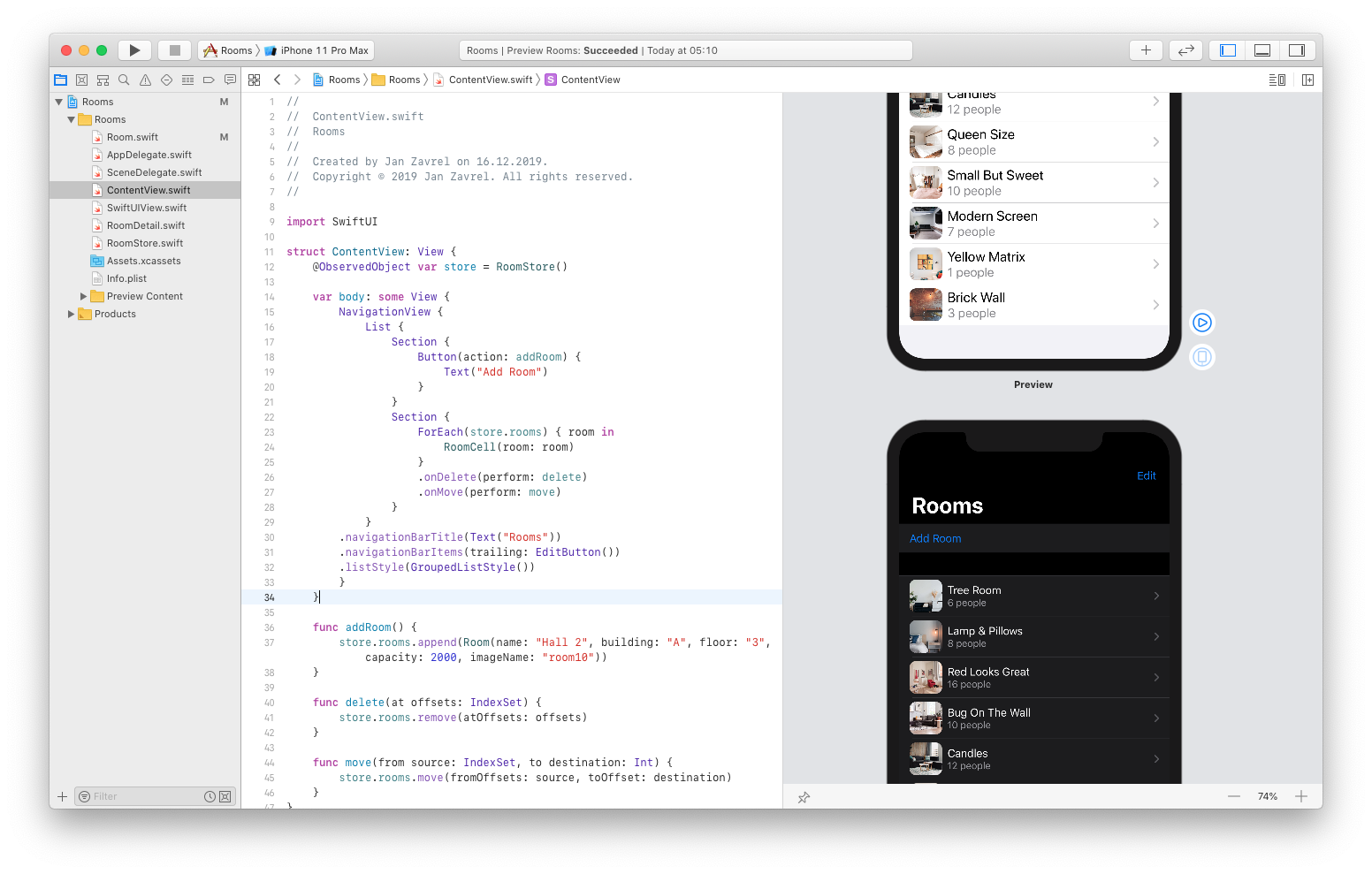
We will go together through the entire process of building the SwiftUI app starting from scratch. We will create a list of fancy conference rooms based on the SwiftUI Introductory session which Apple held in WWDC 2019. Sadly, the code they used in that session is already outdated, so if you follow that video, you'll get stuck pretty quickly.
That's why I have decided to take this tutorial as an opportunity to create an up-to-date version of the app using the latest SwiftUI API. I also wanted to make it more streamlined and easier to understand, even for total beginners.
A shameless plug
If you prefer a video-course version of this text-based tutorial, go get it for free on Skillshare. If you're new to Skillshare, you'll get premium access not only to this course for free, but to all of my other courses as well and for a good measure, to over 22.000 courses currently hosted on Skillshare. You won't be charged anything for your first 2 months and you can cancel your membership whenever you want within that period. Consider it a 2 months worth of premium education for free. It's like Netflix, only for life-long learners :-)

What you'll need
To make the most of this tutorial and to be able to truly follow me step by step, you'll need macOS Catalina or newer and Xcode 11 or newer. With Xcode 11, Apple introduced live previews so you no longer need to compile your project and run it in the Simulator each time you make some changes to your code. However, this feature won't work on older macOS. So even though, you can install Xcode 11 on older macOS, you won't get live previews unless you run Catalina.
Resources
To save your time I prepared some resources so you don't have to manually type everything from scratch. You'll find everything I'm referring to in the video in a package called swiftui-rooms-resources.zip file which you should download and unpack to the location of your choice.
You'll find it at www.zavrel.net/swiftui-rooms-resources
Creating a basic structure
Run Xcode, create a new Single View App project and call it Rooms.
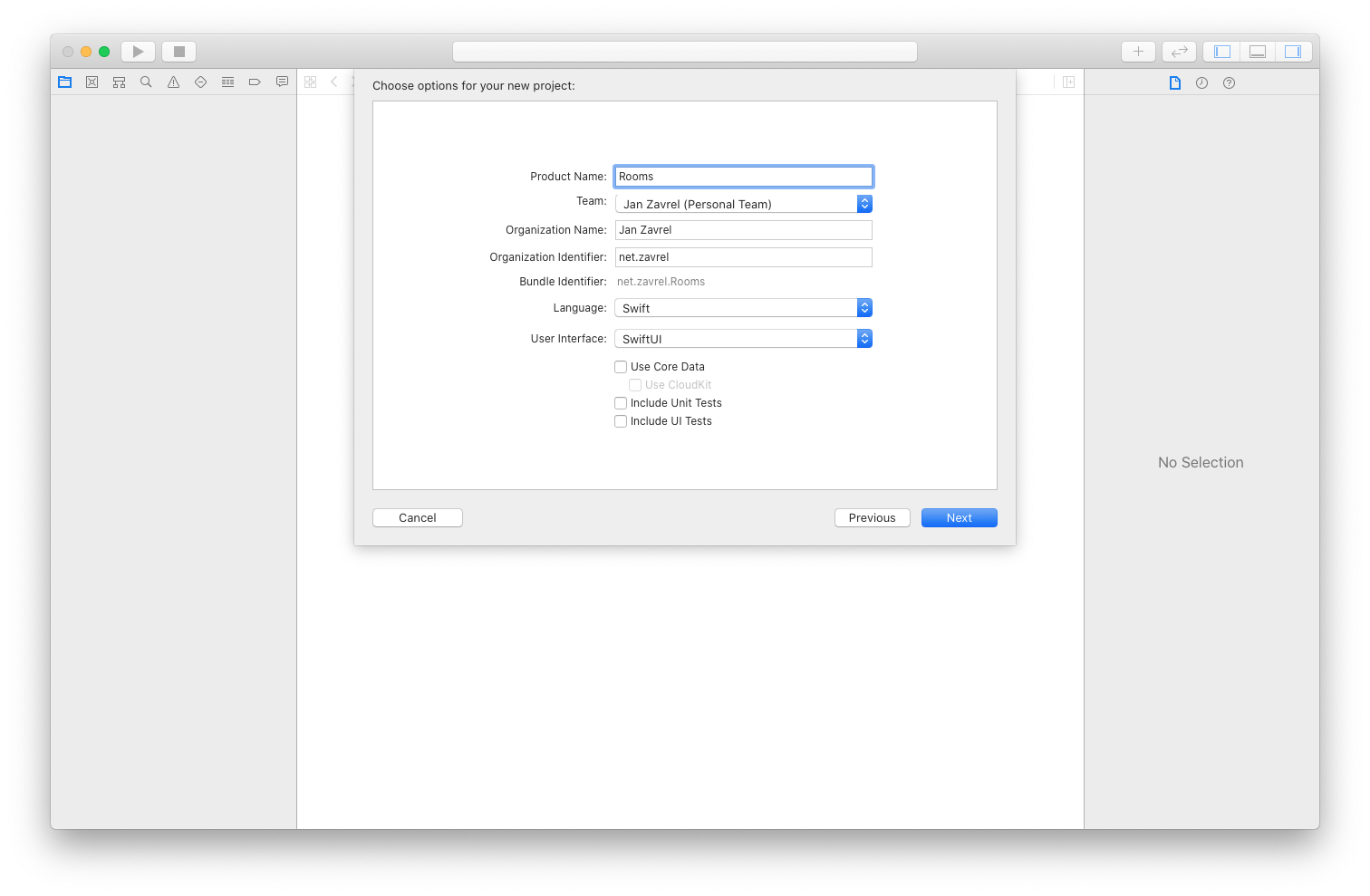
Before you hit the Next button, make sure that the Language is set to Swift and the User Interface to SwiftUI.
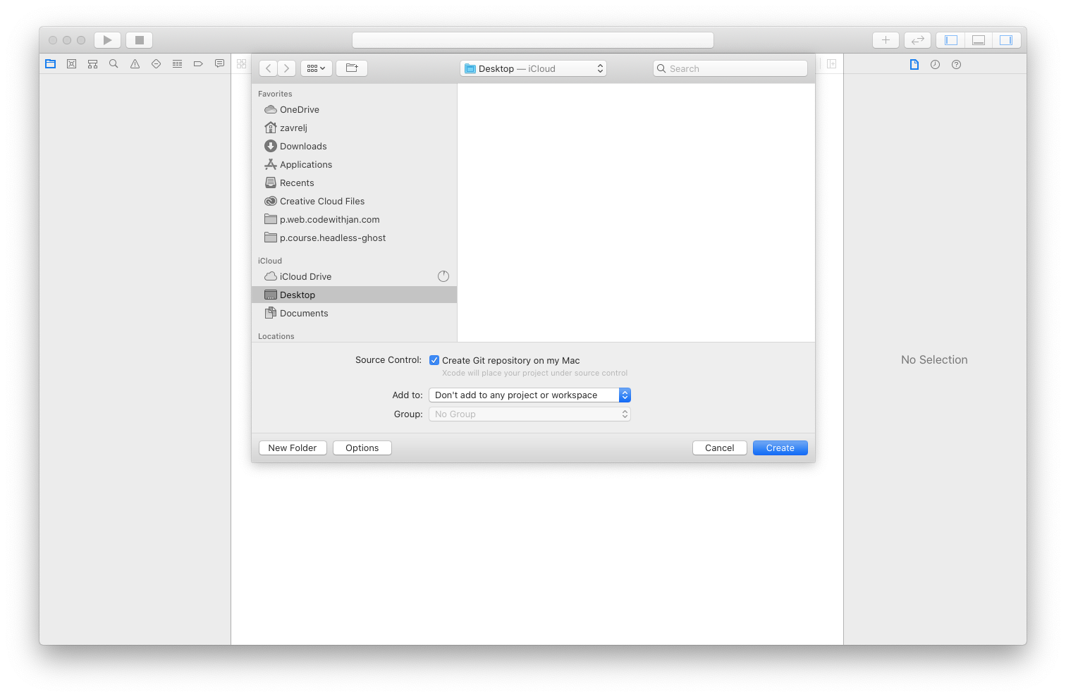
In the next window, check the Source Control and save the project to the Desktop.
This is what your Xcode project should look like.
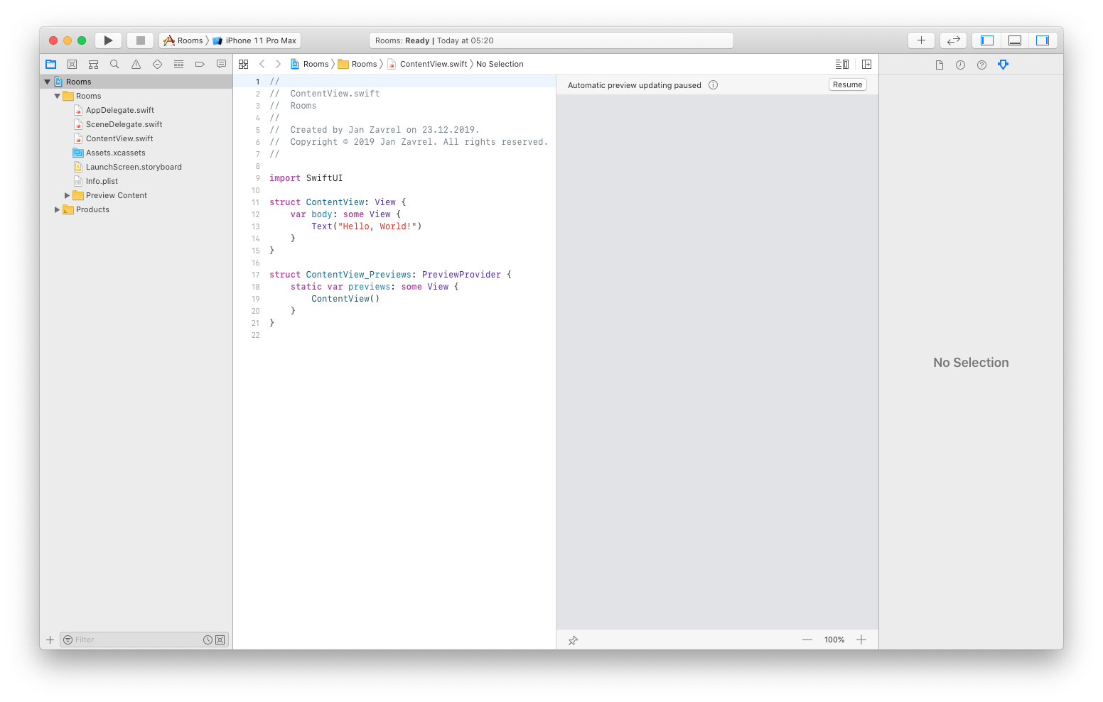
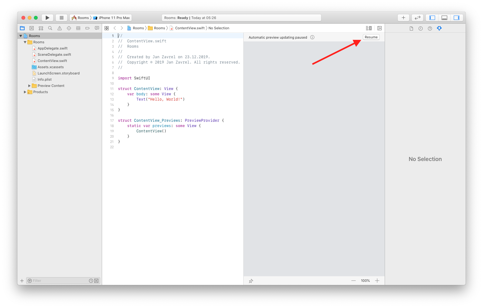
I hope you're at least somewhat familiar with Xcode. If you're on Catalina, you'll notice the column with automatic preview and you'll probably see the message that "Automatic preview updating paused". When you click the tiny icon next to the message, you'll get the explanation that this is perfectly normal when you make such changes that Xcode has to rebuild your project.
Go ahead and click the Resume button to the right:
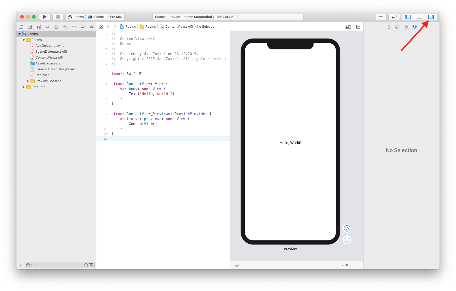
You should see the preview of the iPhone with a simple welcome message at the center of the screen. To have more real estate for coding, let's hide the right pane by click this icon:
If you've been working with Storyboards in the past, this might look familiar. However, with Storyboards, you had to choose whether you wanted to code manually or to build your app with visual items. You couldn't use both at the same time. With SwiftUI, you can go back and forth as you'll soon see.
Go ahead and click the Hello World text on the canvas. It will be automatically selected in the code.
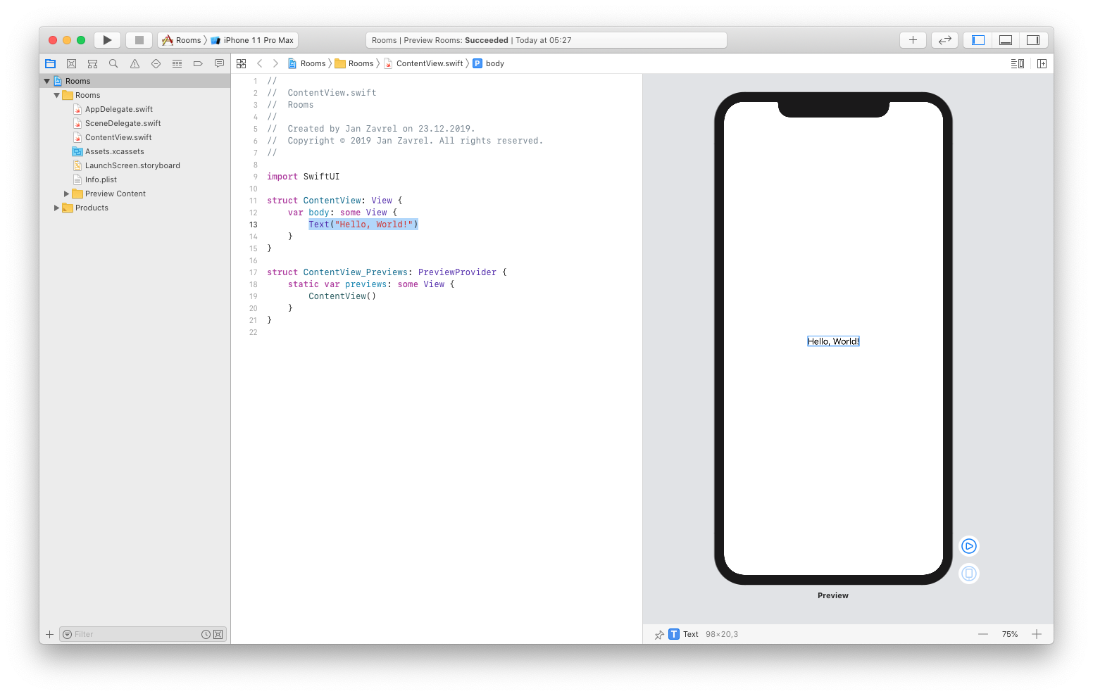
Now, change the text in the code to Rooms and see what happens in the canvas:

That's right. The code and the canvas work together seamlessly!
Since we want to create a list of rooms, let's add some more details about them. This time, though, we will take a visual approach and add a new text by just dragging it out onto the canvas.
Click the big + button at the top and drag the Text view:
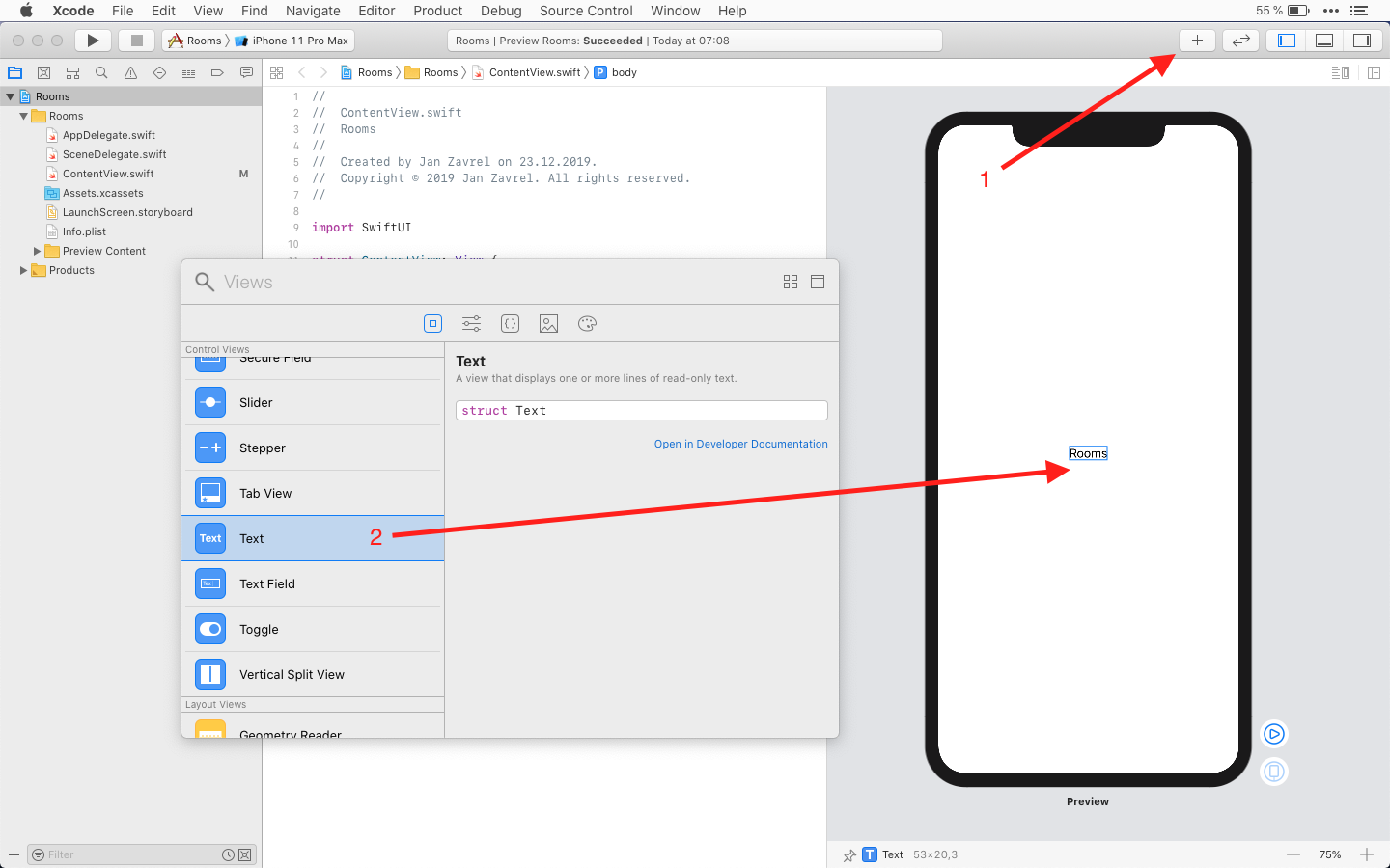
Not only Xcode added the text onto the canvas, but as you can see, it also updated the code and automatically added a vertical stack so both text views are nicely stacked under each other.
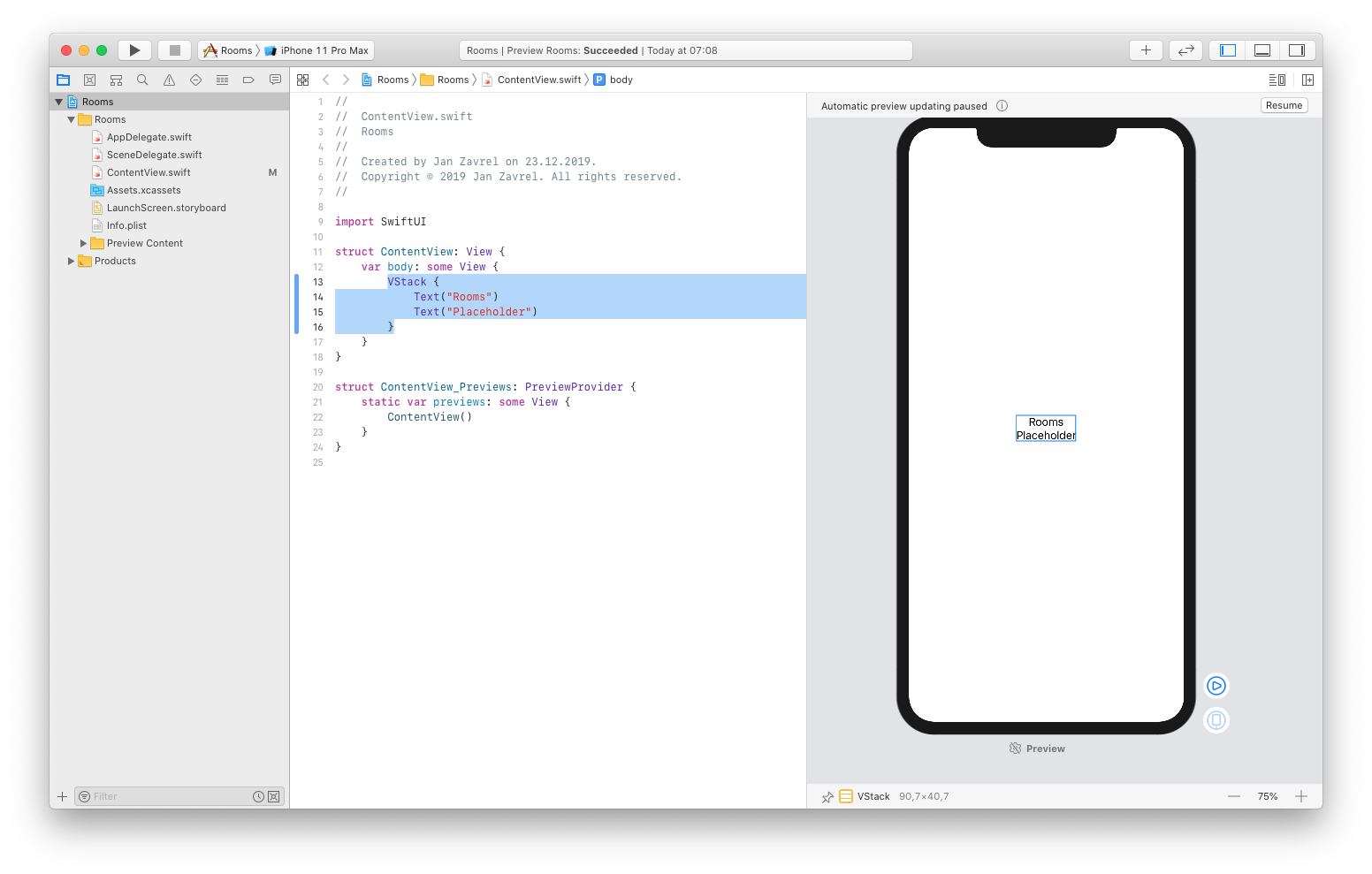
Working with Source Control
Now I hope you've noticed that blue ribbon in the code gutter. This is Git tracking the changes. Click the ribbon and select Show Change from the popup menu to reveal what changes you have made to the code so far. The gray section shows the deleted code and the blue section shows added code. Now, you can commit these changes. This will save this state of the project so you can later return to it if anything goes wrong.
Select Source Control → Commit... from the top menu:

You'll be presented with a new window where you can select the ContentView.swift file to see the changes.
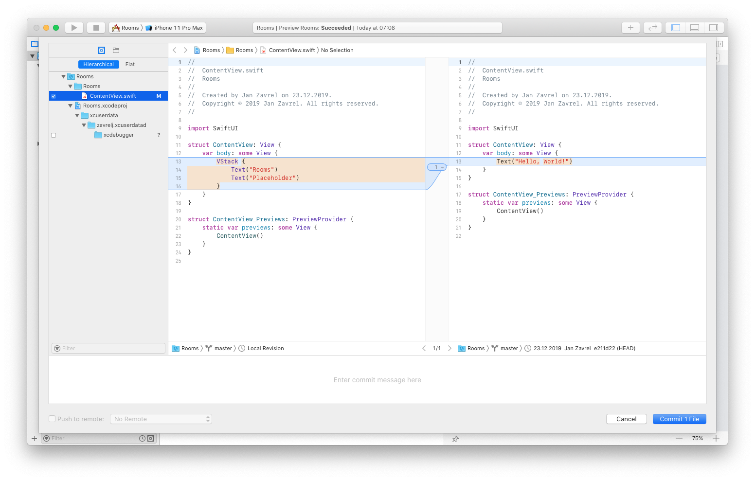
Type the commit message at the bottom of the window and click the Commit 1 File button.

Once you do that, the blue ribbon will disappear, but you can always check the history to see your commits by clicking the Source Control navigator in the top menu, selecting the master branch, and double-clicking the commit:
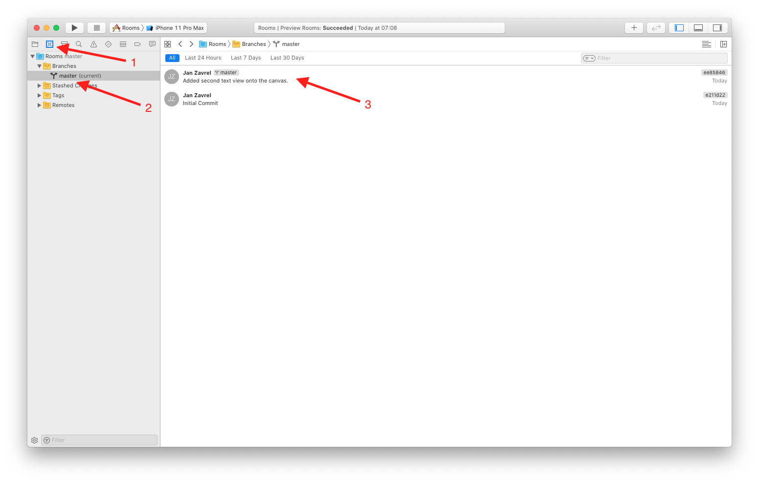
Cool! Now that you know how to commit the changes to your code and build the history, I suggest you do it often, or at least whenever you make some big changes to your code which could potentially lead to disaster. It's better to be safe than sorry and rewrite your work from scratch.
Fine-tuning the layout
Ok, let's go back to our code and replace the Placeholder text with the number of people our room can hold. We will initially use the hard-coded value:
struct ContentView: View {
    var body: some View {
        VStack {
            Text("Rooms")
            Text("20 people")
        }
    }
}
As you'd expect. Two things will happen immediately:
- There's a new blue ribbon as we made a change to our code since the last commit
- Canvas has been updated with a new text
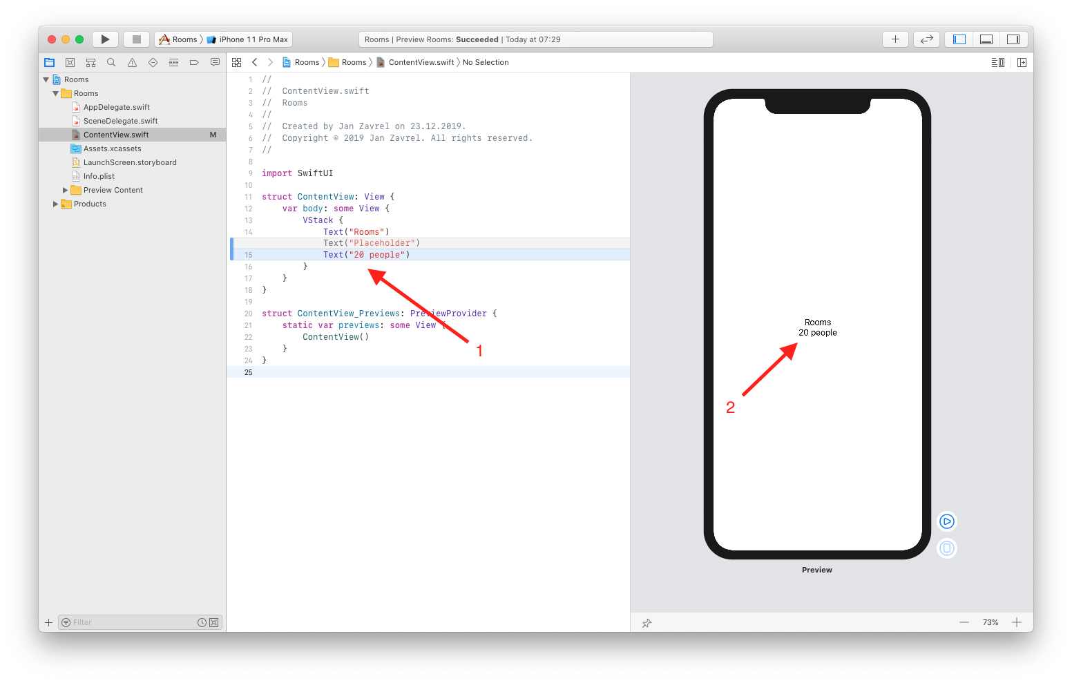
Let's add some image to our room now. With SwiftUI, it's very easy to add a column by using HStack which stands for a horizontal stack. This way, we can define a new column for the image.
Let's wrap our VStack in the HStack to achieve this.
CMD-Click the VStack and select Embed in HStack from the menu:
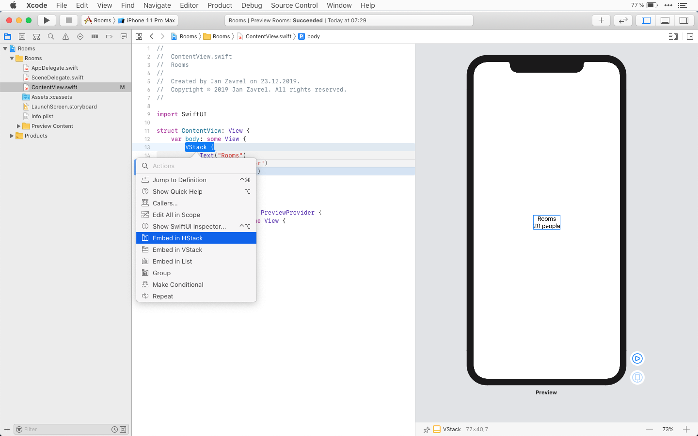
Now we can easily add the image in front of the room description and it will end up in the left column:
struct ContentView: View {
    var body: some View {
        HStack {
            Image(systemName: "photo")
            VStack {
                Text("Rooms")
                Text("20 people")
            }
        }
    }
}
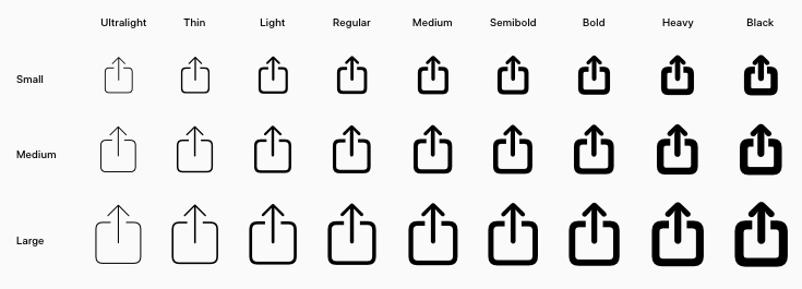
This is the placeholder using the SF Symbols which is a set of over 1,500 highly configurable symbols that you can use in your iOS 13, watchOS 6 and tvOS 13 apps. They come in nine weights and three scales, small, medium and large.
Let's change some properties of our VStack now.
In canvas, CMD+Click the VStack and choose Show SwiftUI Inspector... from the popup menu:
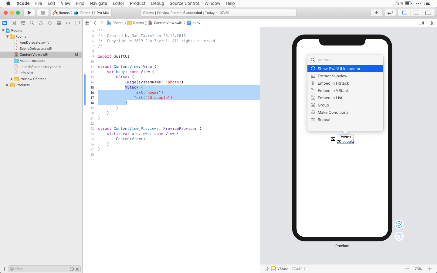
Set the Alignment to leading and watch how the code will change:

Now, let's change the text size of the second Text view and set it to subheadline.
CMD+Click that text in canvas, choose Show SwiftUI Inspector... again and change the Font to Subheadline:
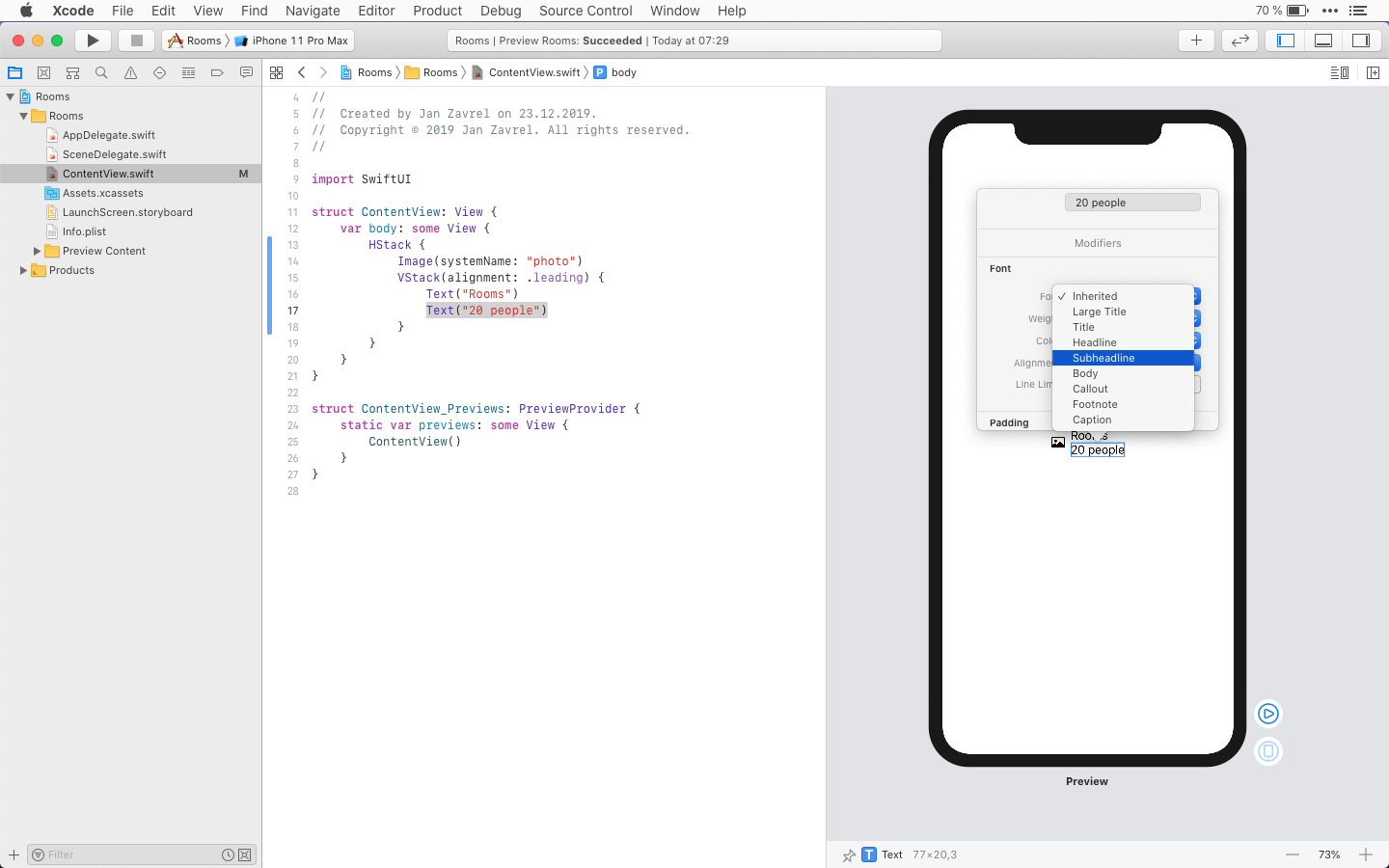
Your code should look like this now:
struct ContentView: View {
    var body: some View {
        HStack {
            Image(systemName: "photo")
            VStack(alignment: .leading) {
                Text("Rooms")
                Text("20 people")
                    .font(.subheadline)
            }
        }
    }
}
The .font(.subheadline) is the so-called modifier. It's a kind of SwiftUI method that customizes how the specific View looks and behaves.
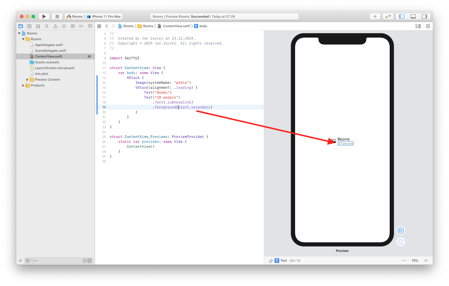
Let's add another modifier in the code now to change the color of the second Text View to be a secondary color:
VStack(alignment: .leading) {
    Text("Rooms")
    Text("20 people")
        .font(.subheadline)
        .foregroundColor(.secondary)
}
Again, this change will immediately update the canvas where the text is gray now:
Creating a list of items
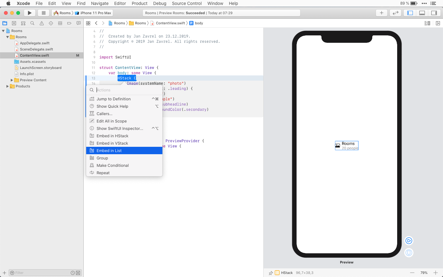
Ok, now it's time to create a list of rooms and you'll see how ridiculously easy it is in SwiftUI. CMD-Click the HStack and select Embed in List from the popup menu:
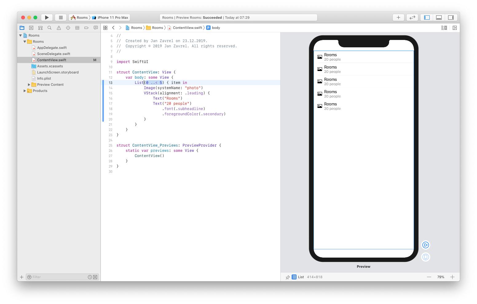
By default, Xcode will create a list of five items. And, as you might expect, that code changes will be rendered in the canvas as well:
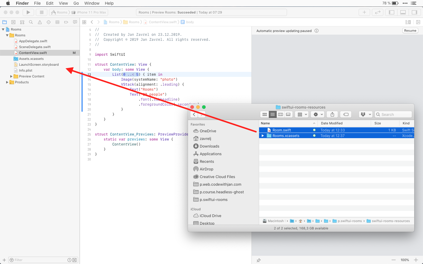
Ok, now it's time to add some external data, so open the swift-room-resources folder and drag everything to Xcode's Project navigator in the left pane:
Let's take a look at the Room.swift file.
import SwiftUI

struct Room: Identifiable {
    var id = UUID()
    var name: String
    var building: String
    var floor: String
    var capacity: Int
    var hasVideo: Bool = false
    var imageName: String
}

let testData = [
    Room(name: "Tree Room", building: "A", floor: "1", capacity: 6, hasVideo: true, imageName: "room01"),
    Room(name: "Lamp & Pillows", building: "B", floor: "1", capacity: 8, hasVideo: false, imageName: "room02"),
    Room(name: "Red Looks Great", building: "D", floor: "2", capacity: 16, hasVideo: true, imageName: "room03"),
    Room(name: "Bug On The Wall", building: "A", floor: "3", capacity: 10, hasVideo: true, imageName: "room04"),
    Room(name: "Candles", building: "C", floor: "3", capacity: 12, hasVideo: false, imageName: "room05"),
    Room(name: "Queen Size", building: "F", floor: "1", capacity: 8, hasVideo: false, imageName: "room06"),
    Room(name: "Small But Sweet", building: "E", floor: "1", capacity: 10, hasVideo: true, imageName: "room07"),
    Room(name: "Modern Screen", building: "B", floor: "4", capacity: 7, hasVideo: false, imageName: "room08"),
    Room(name: "Yellow Matrix", building: "D", floor: "3", capacity: 1, hasVideo: false, imageName: "room09")
]
It contains the Room struct which has seven properties that define the id and the name of the room as well as where the room is located, what's its capacity, whether it has video conferencing setup and finally, even the photo of the room.
Our struct conforms to Identifiable protocol which means that it can be identified uniquely. Also, there must be a property called id that contains a unique identifier. As you can see, we covered that as well by defining the id property as UUID() which stands for a universally unique identifier.
UUIDs are long hexadecimal strings such as 08B15DB4-2F02-4AB8-A965-67A9C90D8A44. If we generated 1 UUID every second for a billion years, we might begin to have the slightest chance of generating a duplicate, so I guess this is indeed a pretty unique identifier.
Below the struct definition, we have an array of nine instances of Room struct, each holding its own set of properties with specific values. We will use these test data for debugging our app.
Now, to pass our test data from the Room.swift file, we need to add a new property to our ContentView struct. So back in the ContentView.swift file, add a new variable named rooms which is an array of instances of the Room struct:
struct ContentView: View {
    var rooms: [Room] = []

    var body: some View {
        List(0 ..< 5) { item in
            Image(systemName: "photo")
            VStack(alignment: .leading) {
                Text("Rooms")
                Text("20 people")
                    .font(.subheadline)
                    .foregroundColor(.secondary)
            }
        }
    }
}
Next, we'll pass our test data to the preview:
struct ContentView_Previews: PreviewProvider {
    static var previews: some View {
        ContentView(rooms: testData)
    }
}
This means that we just use the testData array defined in the Rooms.swift file.
Now we can finally use our test data in the list instead of hardcoded values.
So we will list the items of the rooms array while each item will be referred to as room. This way, we can access the properties of an individual item, like a name:
var body: some View {
        List(rooms) { room in
            Image(systemName: "photo")
            VStack(alignment: .leading) {
                Text(room.name)
                Text("20 people")
                    .font(.subheadline)
                    .foregroundColor(.secondary)
            }
        }
}
And sure enough! Our list of rooms is immediately updated in the preview so it shows all nine items and their names coming from the testData array.
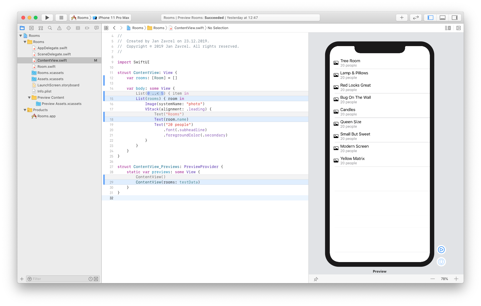
I'll just commit the changes because this is a huge step forward!
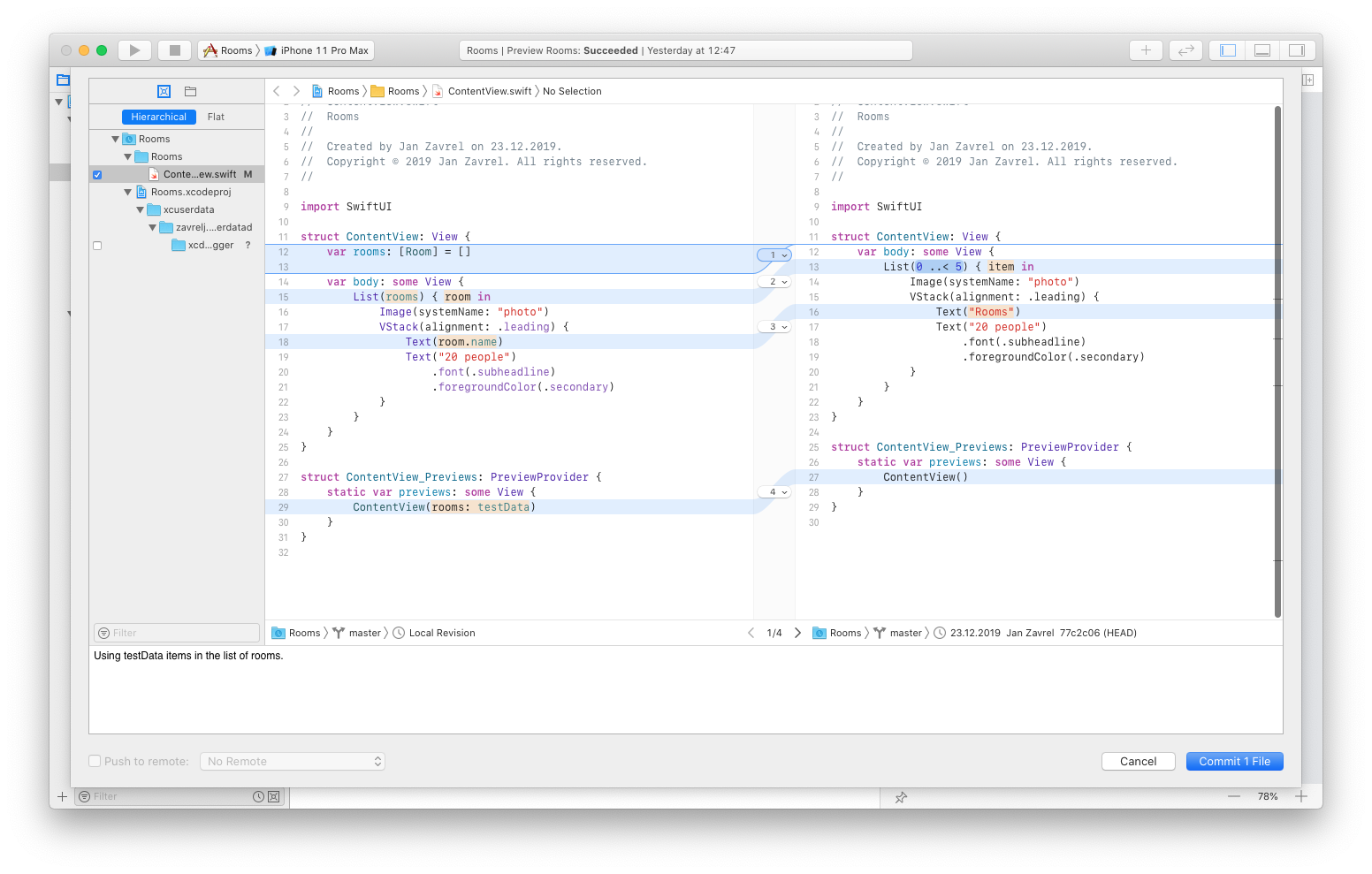
Adding more details about rooms
Ok, let's use another information from our test data, which is the capacity of people for each room:
var body: some View {
    List(rooms) { room in
        Image(systemName: "photo")
        VStack(alignment: .leading) {
            Text(room.name)
            Text("\(room.capacity) people")
                .font(.subheadline)
                .foregroundColor(.secondary)
        }
    }
}
Putting the room.capacity property inside the backslash and parentheses (room.capacity) allows us to directly transfer the Int type to String type. This is a so-called string interpolation which is just a fancy name for combining variables and constants inside the string.
Finally, we can use real images for our rooms instead of the system placeholders:
var body: some View {
    List(rooms) { room in
        Image(room.imageName)
        VStack(alignment: .leading) {
            Text(room.name)
            Text("\(room.capacity) people")
                .font(.subheadline)
                .foregroundColor(.secondary)
        }
    }
}
Ok, but this is not what we wanted to achieve here:
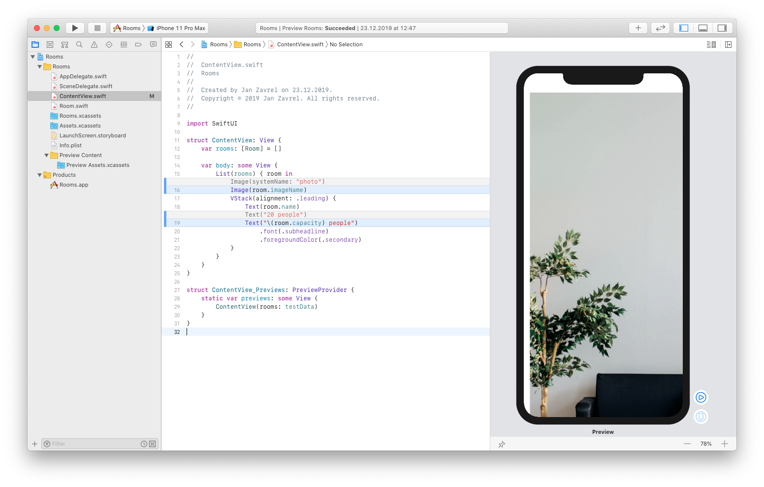
The problem is that Xcode will use the original image size by default and since our room photos are 1024x1024 pixels, one image will easily use the whole screen and some more.
But, there's an easy fix.
First, we need to tell SwiftUI that are images are resizeable, next, we will change their size to 50x50 pixels:
var body: some View {
    List(rooms) { room in
        Image(room.imageName)
            .resizable()
            .frame(width: 50.0, height: 50.0)
        VStack(alignment: .leading) {
            Text(room.name)
            Text("\(room.capacity) people")
                .font(.subheadline)
                .foregroundColor(.secondary)
        }
    }
}
Now it looks much better, but I want to add one final touch. Let's make the corners rounded:
var body: some View {
    List(rooms) { room in
        Image(room.imageName)
            .resizable()
            .frame(width: 50.0, height: 50.0)
            .cornerRadius(10)
        VStack(alignment: .leading) {
            Text(room.name)
            Text("\(room.capacity) people")
                .font(.subheadline)
                .foregroundColor(.secondary)
        }
    }
}
Now, it's absolutely perfect!
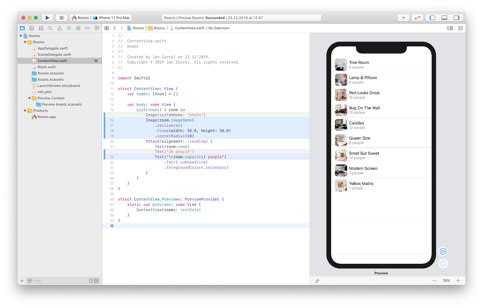
Don't forget to commit the changes so we can move on.
Adding navigation links
Now we want to be able to tap our individual list items to see more details about each room.
First, we need to wrap our list in the NavigationView:
var body: some View {
    NavigationView {
        List(rooms) { room in
            Image(room.imageName)
                .resizable()
                .frame(width: 50.0, height: 50.0)
                .cornerRadius(10)
            VStack(alignment: .leading) {
                Text(room.name)
                Text("\(room.capacity) people")
                    .font(.subheadline)
                    .foregroundColor(.secondary)
            }
        }
    }
}
Next, we will add the title for the navigation bar:
var body: some View {
    NavigationView {
        List(rooms) { room in
            Image(room.imageName)
                .resizable()
                .frame(width: 50.0, height: 50.0)
                .cornerRadius(10)
            VStack(alignment: .leading) {
                Text(room.name)
                Text("\(room.capacity) people")
                    .font(.subheadline)
                    .foregroundColor(.secondary)
            }
        }
        .navigationBarTitle("Rooms")
    }
}
In order to be able to make our items clickable, or rather tappable, we need to transform them into buttons. This is pretty easy. We'll just wrap the items in NavigationLink which takes a destination which will be our detail view, but we'll start with a simple text for now and display just the room name:
var body: some View {
    NavigationView {
        List(rooms) { room in
            NavigationLink(destination: Text(room.name)) {
                Image(room.imageName)
                    .resizable()
                    .frame(width: 50.0, height: 50.0)
                    .cornerRadius(10)
                VStack(alignment: .leading) {
                    Text(room.name)
                    Text("\(room.capacity) people")
                        .font(.subheadline)
                        .foregroundColor(.secondary)
                }
            }
        }
    .navigationBarTitle("Rooms")
    }
}
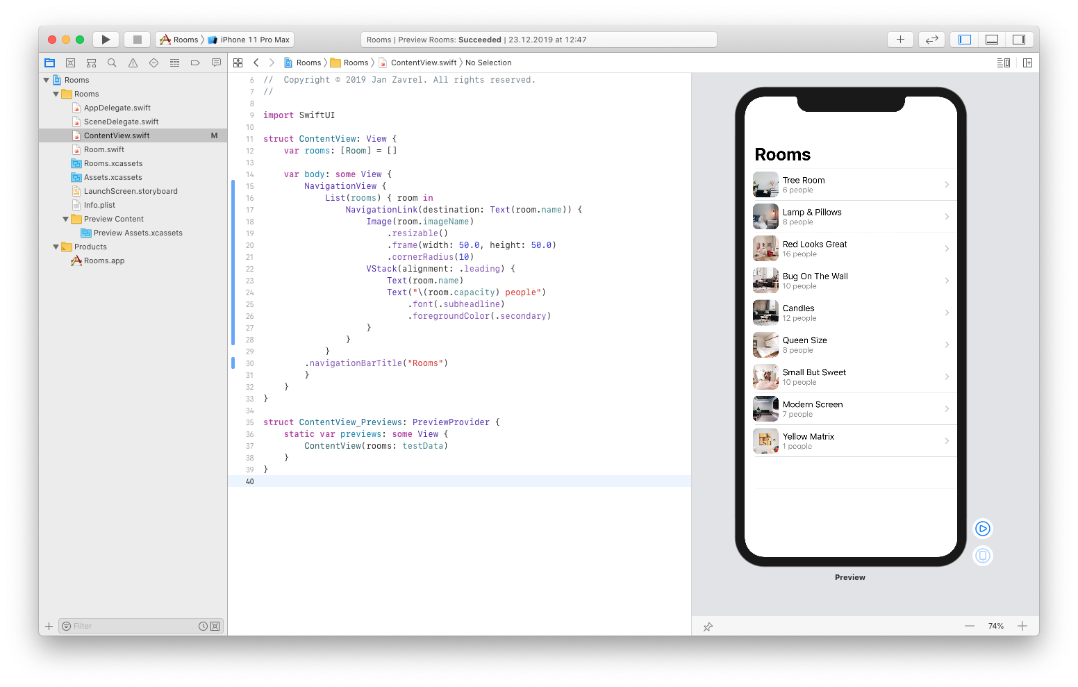
Notice how SwiftUI automatically added an arrow next to each item that indicates that there's more content available.
Now, click the play button to test the behavior of the app:
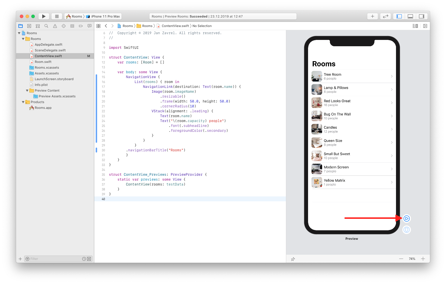
You'll get to the live mode, where you can interact with the preview. You should be able to tap each item and see the name of the room in the middle of the screen. You can also go back by tapping the < Rooms link at the top-left corner. Alternatively, you can also swipe from the left edge as you'll familiar with from your iPhone, and everything works as expected without writing any additional code. That's the power of SwiftUI.
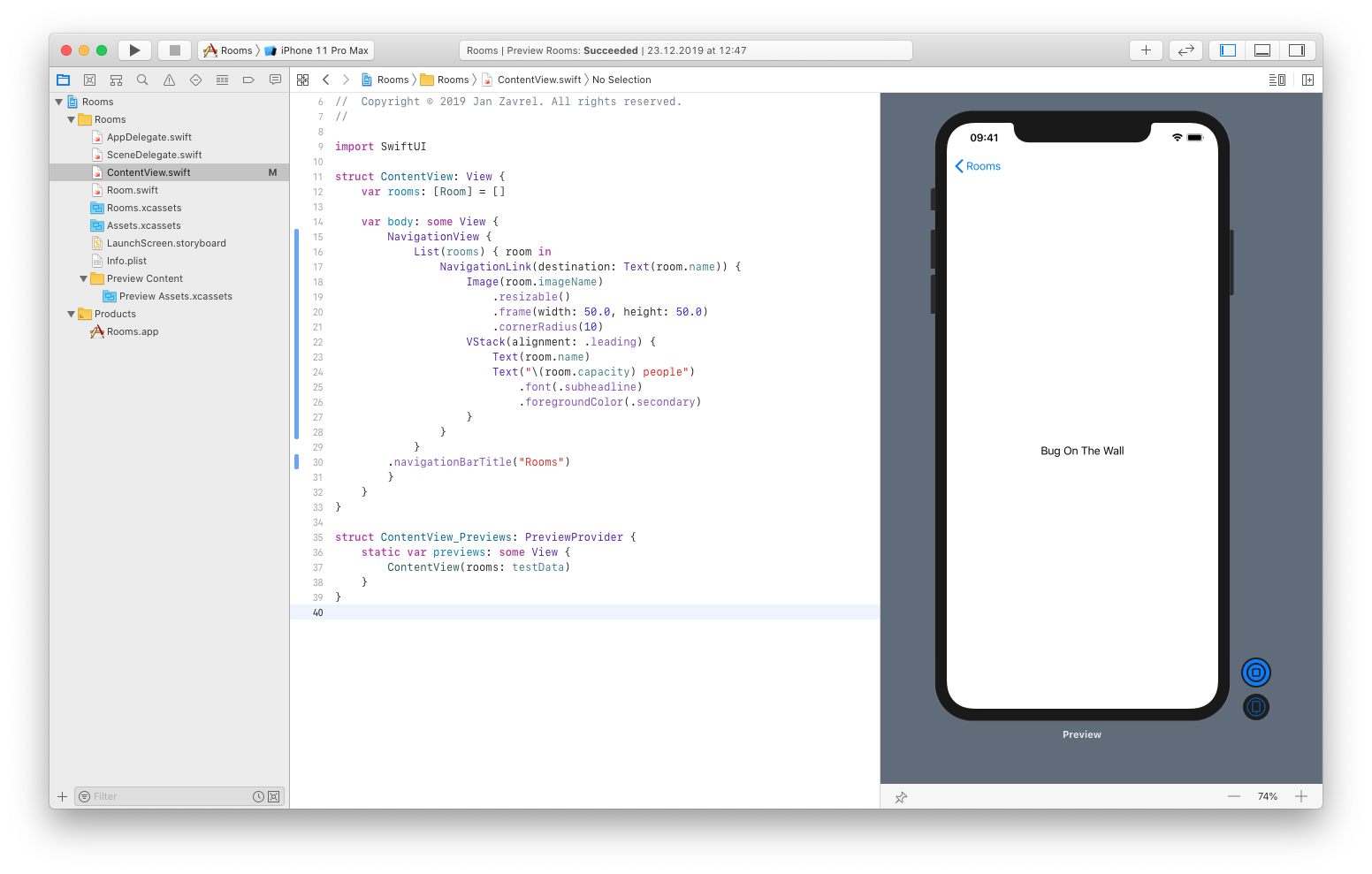
When you're done, hit the blue stop button:
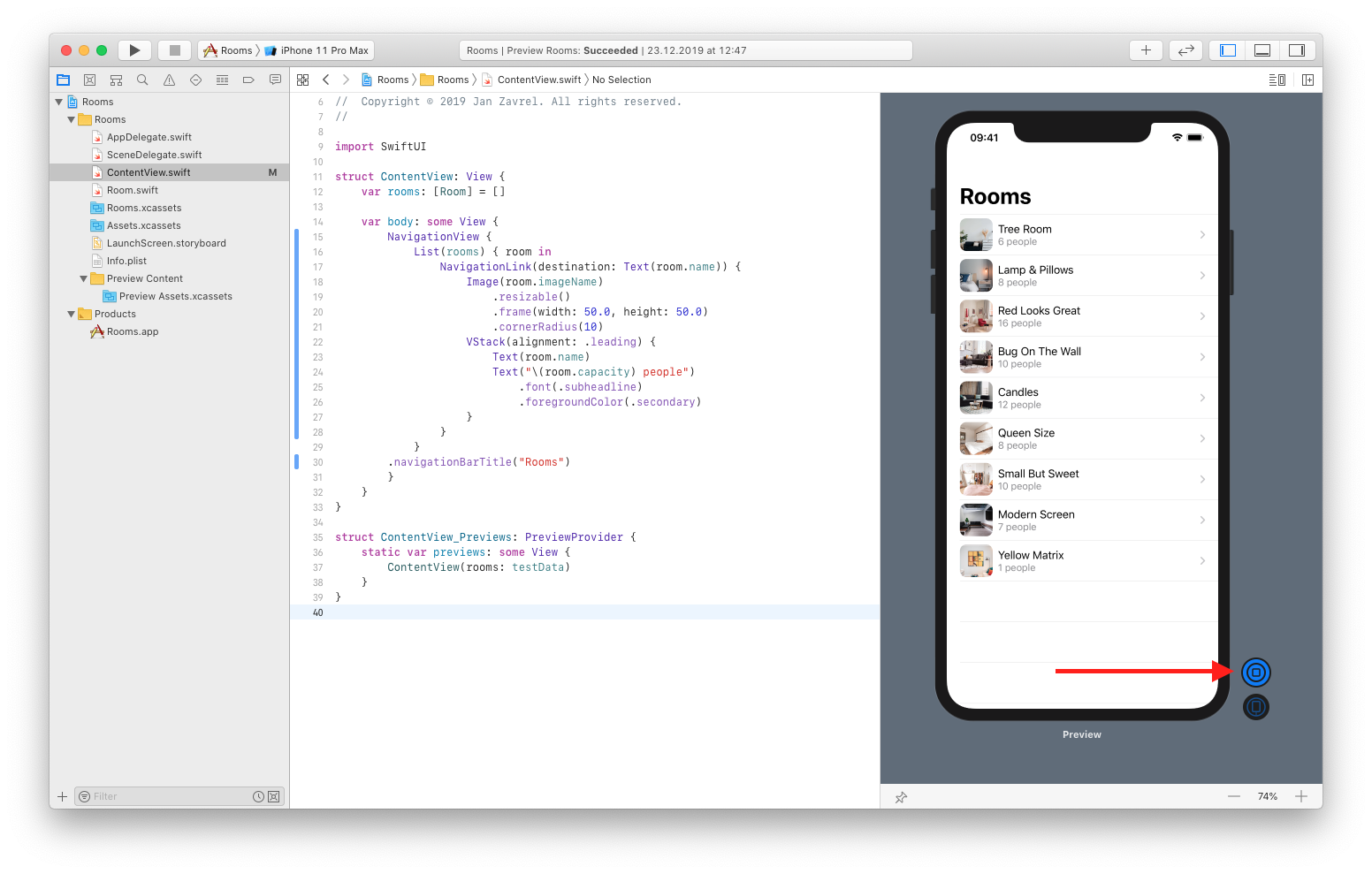
Great job! Let's commit our changes.
Extracting Subview
Now I'll show you how to make the code more organized and readable by extracting subviews.
CMD-Click the NavigationLink view and choose Extract Subview from the popup-menu:
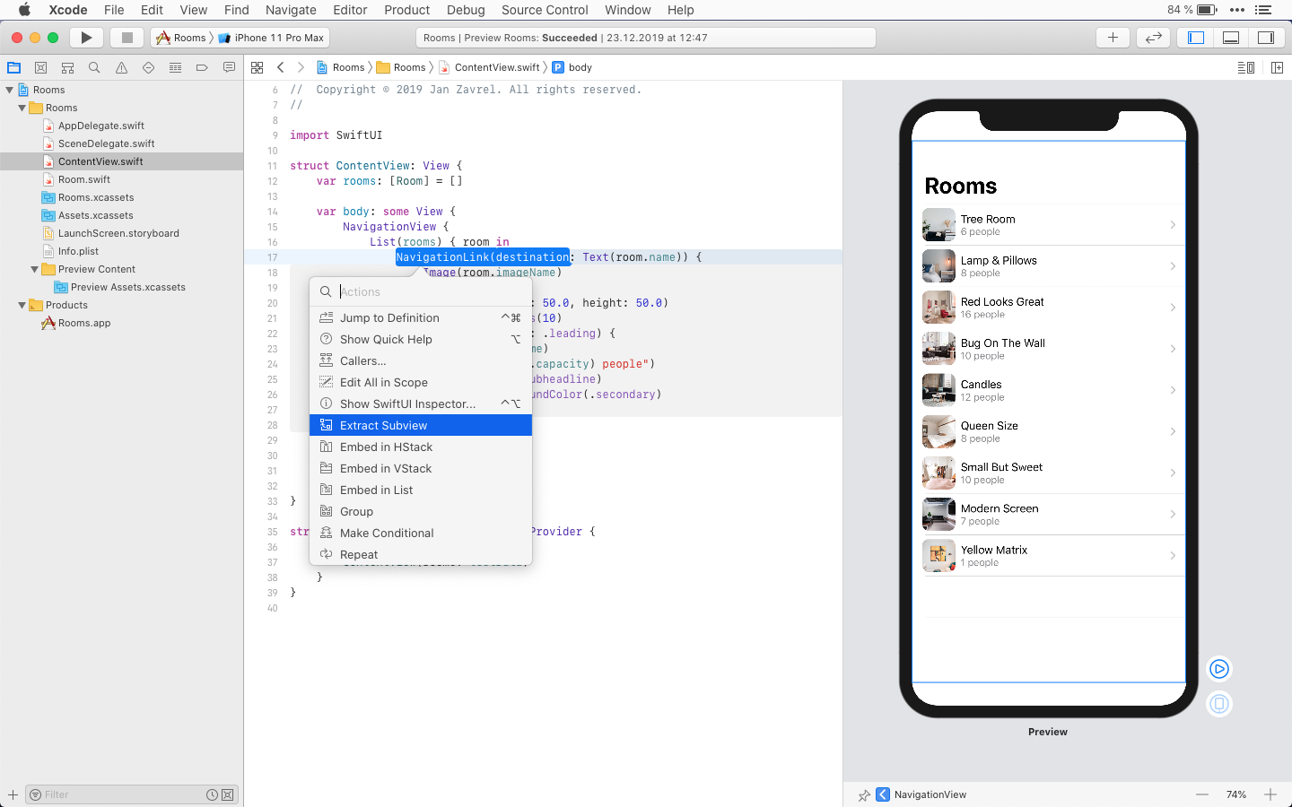
Xcode will create a new struct with the extracted content and we'll link it back by choosing the name for our new View which will be RoomCell in our case:
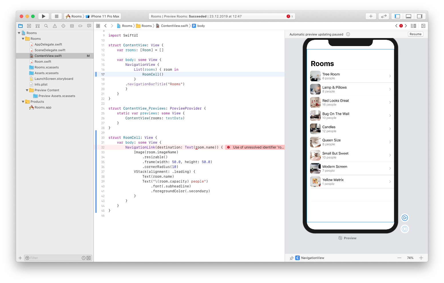
As you can see, we have an unresolved identifier "room" which means that we didn't pass the room instance to this subview yet.
To fix this, we need to:
- create the room constant of the Room type in our subview
- pass the room parameter when calling our newly created RoomCell subview
struct RoomCell: View {
    let room: Room

    var body: some View {
        NavigationLink(destination: Text(room.name)) {
            Image(room.imageName)
                .resizable()
                .frame(width: 50.0, height: 50.0)
                .cornerRadius(10)
            VStack(alignment: .leading) {
                Text(room.name)
                Text("\(room.capacity) people")
                    .font(.subheadline)
                    .foregroundColor(.secondary)
            }
        }
    }
}
var body: some View {
    NavigationView {
        List(rooms) { room in
            RoomCell(room: room)
        }
    .navigationBarTitle("Rooms")
    }
}
We didn't add any new functionality with this modification, but we made our code more readable because the body now contains just the list of room instances that are defined in the RoomCell struct.
You can test in the live mode that everything works exactly as before we changed this.
When you're done, commit the changes so we can move on.
Creating a detail view
Ok, let's build our detail view now.
We'll create a new file with the SwiftUI template, so go to File → New → File... (or click CMD+N) and select SwiftUI View in iOS tab:
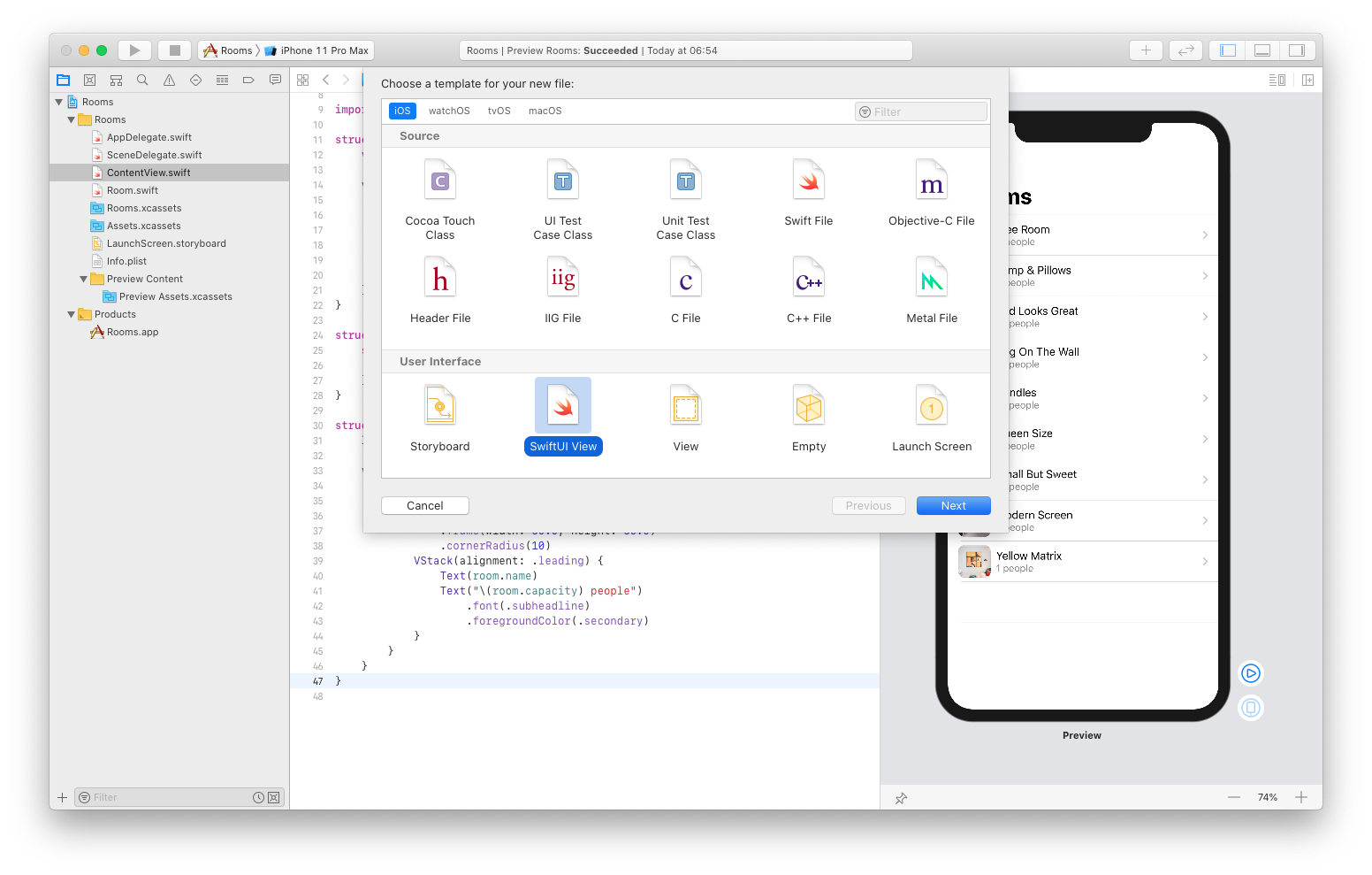
Let's save it as RoomDetail.
As you can see, Xcode created a new View struct and preview code:

Now, to see the content of our test data list of rooms, we need to add a new property to our RoomDetail struct and pass it to the preview as well.
First, create a new constant named room which is a type of Room:
struct RoomDetail: View {
    let room: Room

    var body: some View {
        Text("Hello, World!")
    }
}
Next, let's call the RoomDetail struct to create an instance with values loaded from the first item in our testData array:
struct RoomDetail_Previews: PreviewProvider {
    static var previews: some View {
        RoomDetail(room: testData[0])
    }
}
Finally, we can use that data in the body of our detail view.
Let's load the image first:
struct RoomDetail: View {
    let room: Room

    var body: some View {
        Image(room.imageName)
    }
}
As you can see, this will load the image of the first room from our list:
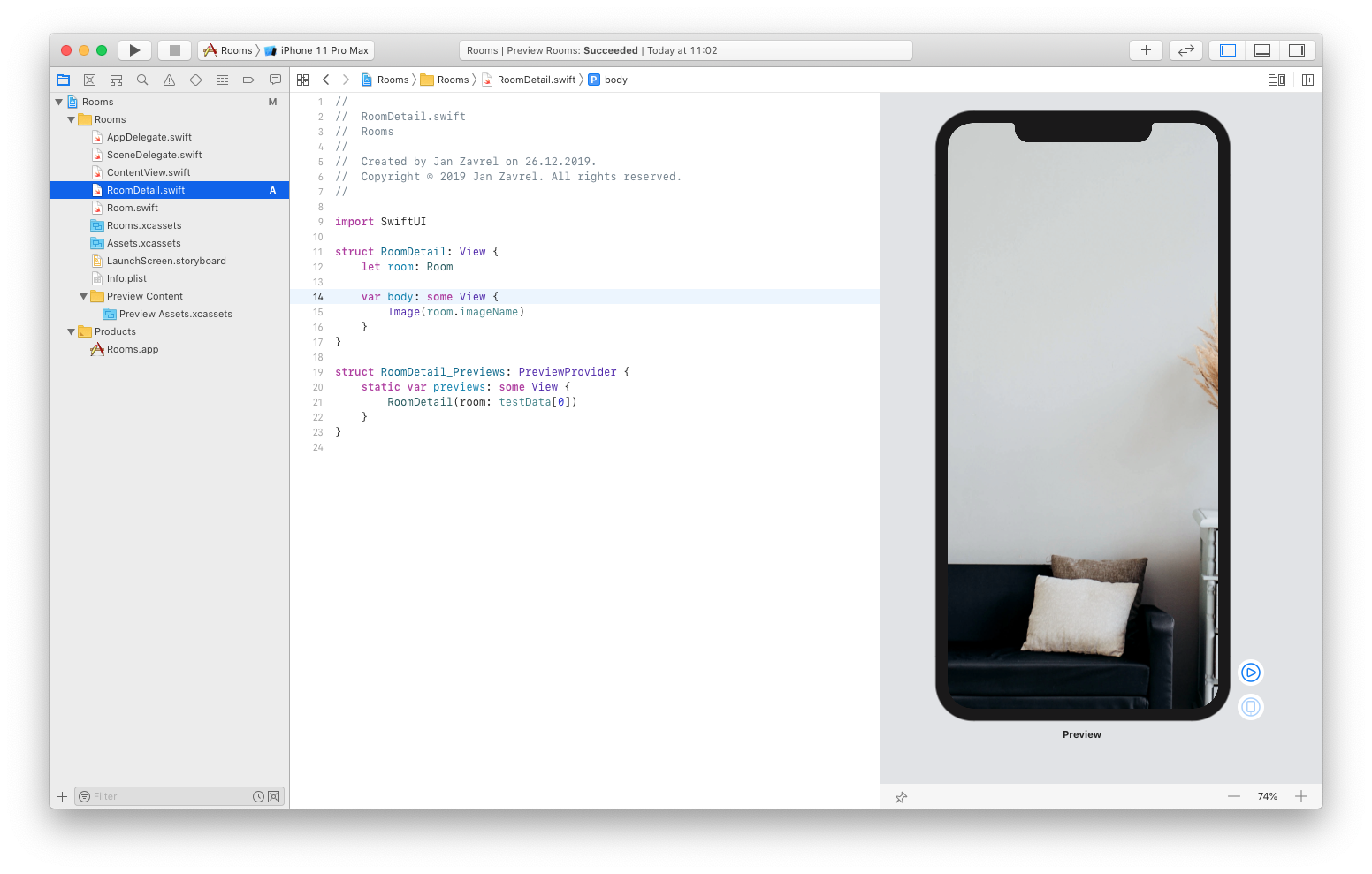
But unfortunately, it's too large for our view, because, as you already know, SwiftUI shows all images at their original size by default.
Luckily, there's an easy fix we already used. So let's add the .resizable() modifier to our image, and to maintain its aspect ratio, we'll add another modifier, the .aspectRatio with contentMode set to .fit:
struct RoomDetail: View {
    let room: Room

    var body: some View {
        Image(room.imageName)
            .resizable()
            .aspectRatio(contentMode: .fit)
    }
}
Great job! Let's commit the changes so we can move on.
Now we need to update the items so they push our newly-created RoomDetail view once tapped.
So go back to the ContentView.swift file and update the destination of the NavigationLink:
var body: some View {
    NavigationLink(destination: RoomDetail(room: room)) {
        Image(room.imageName)
            .resizable()
            .frame(width: 50.0, height: 50.0)
            .cornerRadius(10)
        VStack(alignment: .leading) {
            Text(room.name)
            Text("\(room.capacity) people")
                .font(.subheadline)
                .foregroundColor(.secondary)
        }
    }
}
Run the live mode in Preview and tap any item to see the appropriate image of the room:
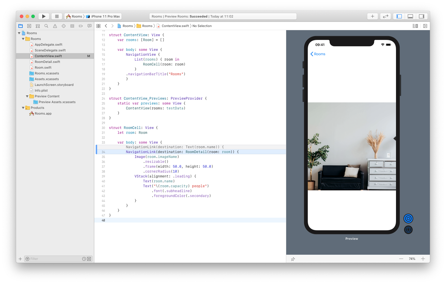
Ok, let's add the title of the detail view.
Go back to the RoomDetail.swift file and add another modifier to the Image:
var body: some View {
    Image(room.imageName)
        .resizable()
        .aspectRatio(contentMode: .fit)
        .navigationBarTitle(Text(room.name))
}
To see it in the preview, just wrap RoomDetail in the Navigation View like this:
struct RoomDetail_Previews: PreviewProvider {
    static var previews: some View {
        NavigationView { RoomDetail(room: testData[0]) }
    }
}
And sure enough, the room name is finally there:
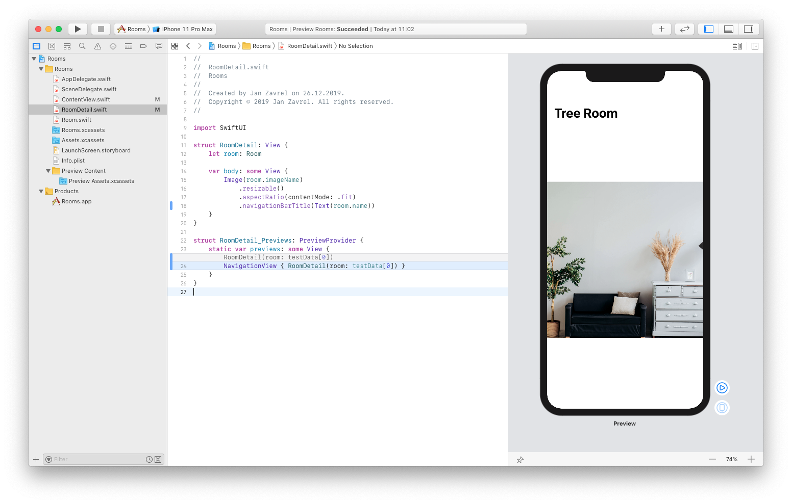
One last thing. Let's make the display mode to be inline for the title so it looks more professional:
var body: some View {
    Image(room.imageName)
        .resizable()
        .aspectRatio(contentMode: .fit)
        .navigationBarTitle(Text(room.name), displayMode: .inline)
}
Now it's much better:
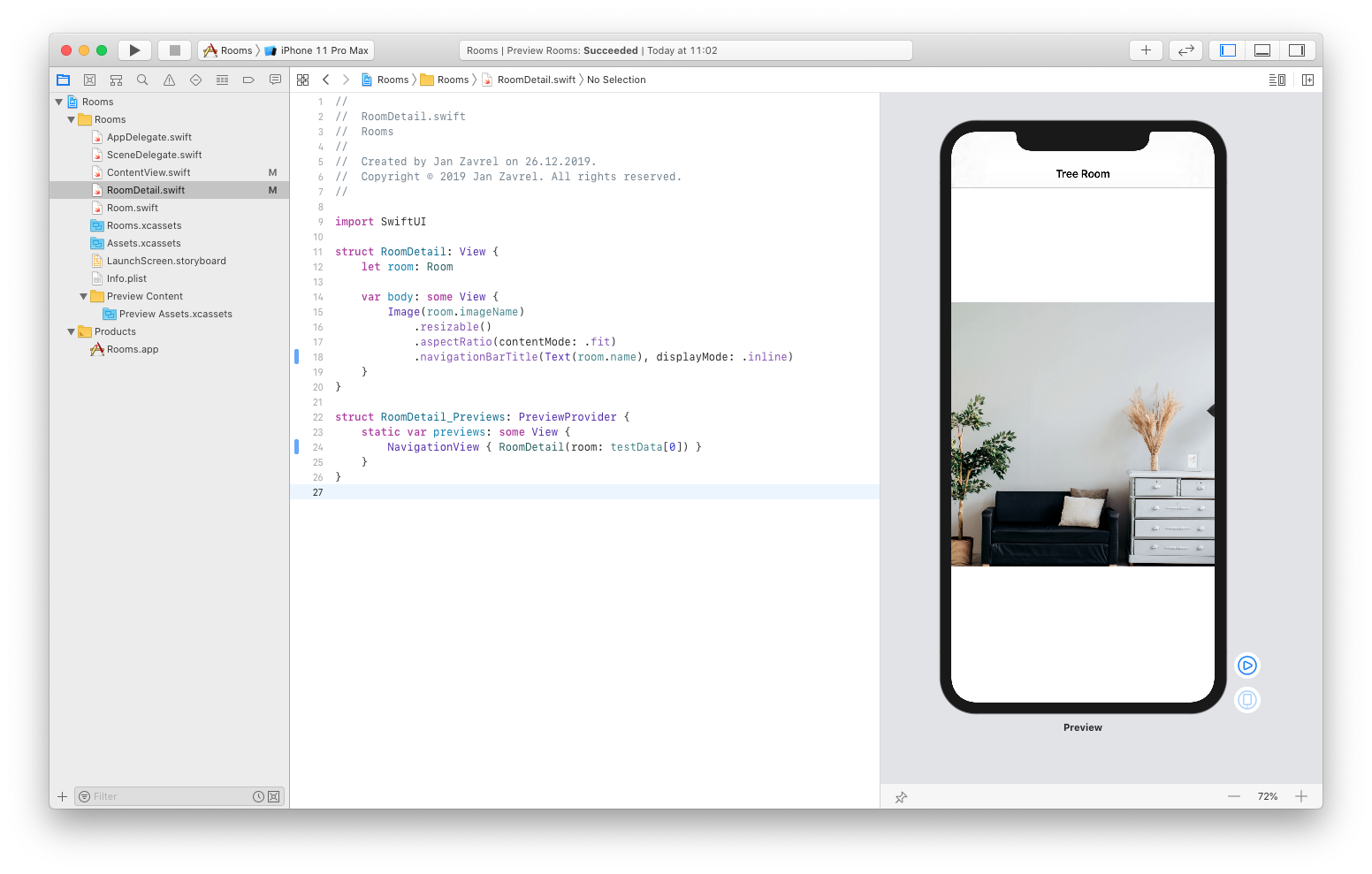
Zooming the image
Now we want to be able to change the contentMode of the aspectRatio from .fit to .fill to be able to see the details of the room image. Yes, we could do it by constantly changing the code like this, but it's out of the question for the regular user so we need to find another way.
First, we'll add a new property that will automatically keep the state of the image, that is whether it's zoomed or not:
struct RoomDetail: View {
    let room: Room
    @State private var zoomed = false

    var body: some View {
        Image(room.imageName)
            .resizable()
            .aspectRatio(contentMode: .fit)
            .navigationBarTitle(Text(room.name), displayMode: .inline)
    }
}
Next, we'll test whether zoomed is true or false and change the contentMode of the aspectRatio accordingly:
struct RoomDetail: View {
    let room: Room
    @State private var zoomed = false

    var body: some View {
        Image(room.imageName)
            .resizable()
            .aspectRatio(contentMode: zoomed ? .fill : .fit)
            .navigationBarTitle(Text(room.name), displayMode: .inline)
    }
}
This is just a shorthand of the if - else code, also known as ternary operator. Basically, you test if the first condition is true (in our case if zoomed is true) and if it is, you'll apply the value behind the question mark, otherwise, you'll apply the value behind the colon.
You'll probably more familiar with this code, but it has the same meaning:
if zoomed {
    .fill
}else{
    .fit
}
Finally, we need to add a tap gesture which will toggle our zoomed property:
struct RoomDetail: View {
    let room: Room
    @State private var zoomed = false

    var body: some View {
        Image(room.imageName)
            .resizable()
            .aspectRatio(contentMode: zoomed ? .fill : .fit)
            .navigationBarTitle(Text(room.name), displayMode: .inline)
            .onTapGesture {
                self.zoomed.toggle()
            }
    }
}
Now, activate the live mode and tap on the image a few times to see how it nicely zooms in and out.
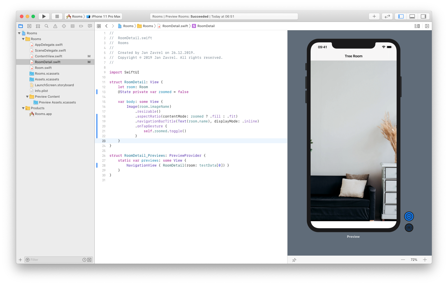
One last thing would be to animate the change so it's more subtle. This is very easy, just wrap the toggle command inside the withAnimation {}
.onTapGesture {
    withAnimation { self.zoomed.toggle() }
}
Test the zooming again. It looks much better now!
Commit the changes so we can move on.
Adding a video icon
Let's add a video icon to the detail view which will indicate whether the room has video-conferencing capabilities. To add views on top of each other, we use the ZStack, so wrap the Image view inside the ZStack and add a new view below it like this:
struct RoomDetail: View {
    let room: Room
    @State private var zoomed = false

    var body: some View {
        ZStack {
            Image(room.imageName)
                .resizable()
                .aspectRatio(contentMode: zoomed ? .fill : .fit)
                .navigationBarTitle(Text(room.name), displayMode: .inline)
                .onTapGesture {
                    withAnimation { self.zoomed.toggle() }
                }

            Image(systemName: "video.fill")
        }
    }
}
And, as you can see the video icon appear in the middle of the screen:
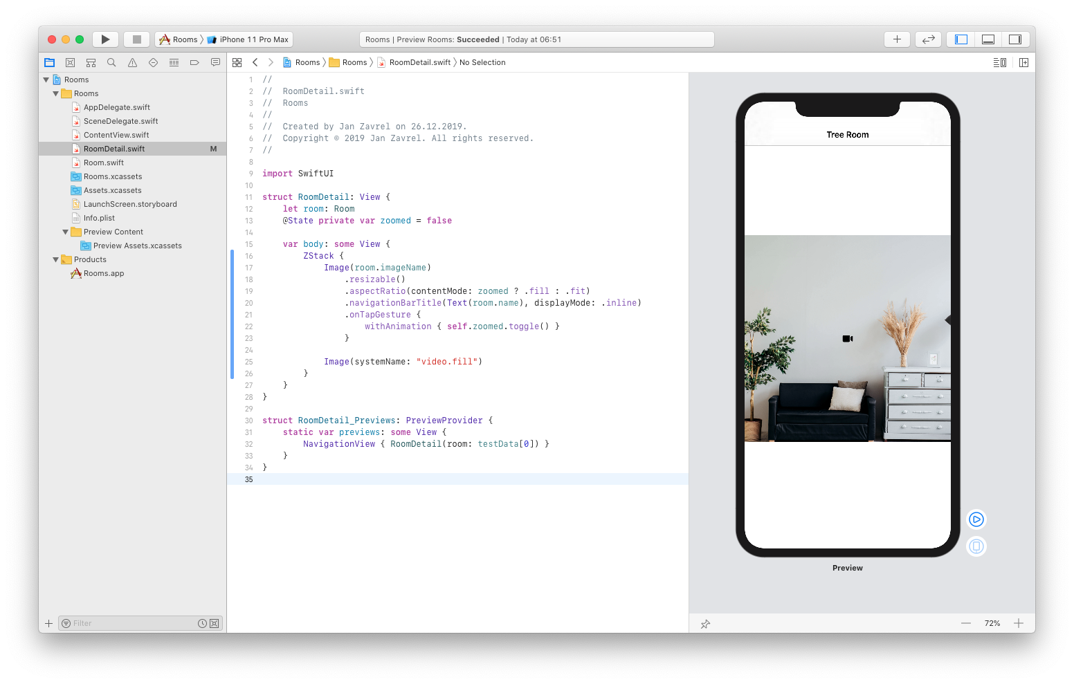
But it's too small, so let's make it larger. Since it's actually a font, we can use a .font modifier:
var body: some View {
    ZStack {
        Image(room.imageName)
            .resizable()
            .aspectRatio(contentMode: zoomed ? .fill : .fit)
            .navigationBarTitle(Text(room.name), displayMode: .inline)
            .onTapGesture {
                withAnimation { self.zoomed.toggle() }
            }

        Image(systemName: "video.fill")
            .font(.title)
    }
}
Now, let's place the video icon to the top-left corner of the room image:
var body: some View {
    ZStack(alignment: .topLeading) {
        Image(room.imageName)
            .resizable()
            .aspectRatio(contentMode: zoomed ? .fill : .fit)
            .navigationBarTitle(Text(room.name), displayMode: .inline)
            .onTapGesture {
                withAnimation { self.zoomed.toggle() }
            }

        Image(systemName: "video.fill")
            .font(.title)
    }
}
And to make it even better-looking, we can add some padding:
var body: some View {
    ZStack(alignment: .topLeading) {
        Image(room.imageName)
            .resizable()
            .aspectRatio(contentMode: zoomed ? .fill : .fit)
            .navigationBarTitle(Text(room.name), displayMode: .inline)
            .onTapGesture {
                withAnimation { self.zoomed.toggle() }
            }

        Image(systemName: "video.fill")
            .font(.title)
            .padding(.all)
    }
}
Now it looks fantastic!

Ok, as always, before we move on, commit the changes.
Adding a flexible frame
What if we want the video icon to be at the very top-left corner of the screen rather than the room image?
We can achieve that by adding the flexible frame modifier to the Image view and specify its width and height so it stretches to fill the whole screen while keeping the room image in its place:
var body: some View {
    ZStack(alignment: .topLeading) {
        Image(room.imageName)
            .resizable()
            .aspectRatio(contentMode: zoomed ? .fill : .fit)
            .navigationBarTitle(Text(room.name), displayMode: .inline)
            .onTapGesture {
                withAnimation { self.zoomed.toggle() }
            }
            .frame(minWidth: 0, maxWidth: .infinity, minHeight: 0, maxHeight: .infinity)

        Image(systemName: "video.fill")
            .font(.title)
            .padding(.all)
    }
}
Now, we want our video icon to appear only when the room has video-conferencing capabilities.
So we'll display the video icon only if the room.hasVideo property is true:
var body: some View {
    ZStack(alignment: .topLeading) {
        Image(room.imageName)
            .resizable()
            .aspectRatio(contentMode: zoomed ? .fill : .fit)
            .navigationBarTitle(Text(room.name), displayMode: .inline)
            .onTapGesture {
                withAnimation { self.zoomed.toggle() }
            }
            .frame(minWidth: 0, maxWidth: .infinity, minHeight: 0, maxHeight: .infinity)

        if room.hasVideo {
            Image(systemName: "video.fill")
                .font(.title)
                .padding(.all)
        }
    }
}
And to check that it's working, we can change the room in our preview data to the one which doesn't have video-conferencing capabilities, so its hasVideo property is false.
Go to the Room.swift file to see that the second room is one of those. Back to the RoomDetail.swift file, let's change the index of the array from 0 to 1 to show the second room:
struct RoomDetail_Previews: PreviewProvider {
    static var previews: some View {
        NavigationView { RoomDetail(room: testData[1]) }
    }
}
And sure enough! The video icon is gone!
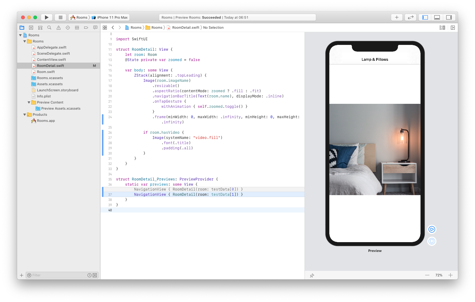
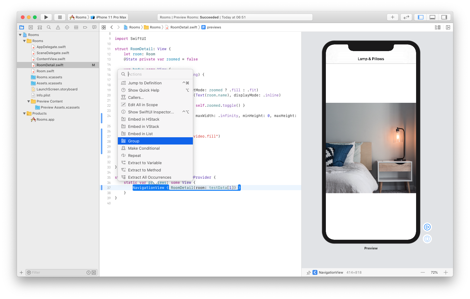
But there's an even better solution. We can have multiple previews, each with a different room. To display multiple previews, we just need to group them, so CMD+Click the NavigationView in the preview section and select the Group option:
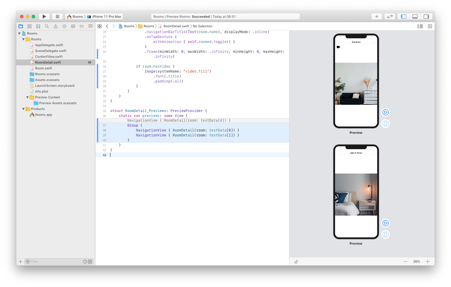
Now we can create a second version of the preview using different test data:
struct RoomDetail_Previews: PreviewProvider {
    static var previews: some View {
        Group {
            NavigationView { RoomDetail(room: testData[0]) }
            NavigationView { RoomDetail(room: testData[1]) }
        }
    }
}
Amazing! Now we can see both previews at the same time!
Commit the changes.
Animating video icon
Now we want to improve the video icon behavior so that it disappears when the image is zoomed.
To do that, we'll just update our condition for showing the video icon like this:
var body: some View {
    ZStack(alignment: .topLeading) {
        Image(room.imageName)
            .resizable()
            .aspectRatio(contentMode: zoomed ? .fill : .fit)
            .navigationBarTitle(Text(room.name), displayMode: .inline)
            .onTapGesture {
                withAnimation { self.zoomed.toggle() }
            }
            .frame(minWidth: 0, maxWidth: .infinity, minHeight: 0, maxHeight: .infinity)

        if room.hasVideo && !zoomed {
            Image(systemName: "video.fill")
                .font(.title)
                .padding(.all)
        }
    }
}
Go ahead and test it in the live mode. When you zoom the image, the video icon disappears. Perfect!
Let's make it even better by making the icon slides out and in:
if room.hasVideo && !zoomed {
      Image(systemName: "video.fill")
          .font(.title)
          .padding(.all)
          .transition(.move(edge: .leading))
}
And let's test it again. Now it's much better!
Finally, we can change the duration of the animation to really appreciate its beauty:
var body: some View {
    ZStack(alignment: .topLeading) {
        Image(room.imageName)
            .resizable()
            .aspectRatio(contentMode: zoomed ? .fill : .fit)
            .navigationBarTitle(Text(room.name), displayMode: .inline)
            .onTapGesture {
                withAnimation(.linear(duration: 2)) { self.zoomed.toggle() }
            }
            .frame(minWidth: 0, maxWidth: .infinity, minHeight: 0, maxHeight: .infinity)

        if room.hasVideo && !zoomed {
            Image(systemName: "video.fill")
                .font(.title)
                .padding(.all)
                .transition(.move(edge: .leading))
        }
    }
}
Great job!
Commit the changes.
Adding room details
Now it's time to make the detailed view really detailed by adding some more information about each room, specifically, where exactly it's located.
You already know how to do this.
First, let's add a Text view with the building number above the Image view:
var body: some View {
    ZStack(alignment: .topLeading) {

        Text("Building: \(room.building)")
            .bold()
            .frame(maxWidth: .infinity, alignment: .center)

        Image(room.imageName)
            .resizable()
            .aspectRatio(contentMode: zoomed ? .fill : .fit)
            .navigationBarTitle(Text(room.name), displayMode: .inline)
            .onTapGesture {
                withAnimation(.linear(duration: 2)) { self.zoomed.toggle() }
            }
            .frame(minWidth: 0, maxWidth: .infinity, minHeight: 0, maxHeight: .infinity)

        if room.hasVideo && !zoomed {
            Image(systemName: "video.fill")
                .font(.title)
                .padding(.all)
                .transition(.move(edge: .leading))
        }
    }
}
Next, let's add another one with the floor number:
var body: some View {
    ZStack(alignment: .topLeading) {

        Text("Building: \(room.building)")
            .bold()
            .frame(maxWidth: .infinity, alignment: .center)

        Text("Floor: \(room.floor)")
            .italic()
            .frame(maxWidth: .infinity, alignment: .center)

        Image(room.imageName)
            .resizable()
            .aspectRatio(contentMode: zoomed ? .fill : .fit)
            .navigationBarTitle(Text(room.name), displayMode: .inline)
            .onTapGesture {
                withAnimation(.linear(duration: 2)) { self.zoomed.toggle() }
            }
            .frame(minWidth: 0, maxWidth: .infinity, minHeight: 0, maxHeight: .infinity)

        if room.hasVideo && !zoomed {
            Image(systemName: "video.fill")
                .font(.title)
                .padding(.all)
                .transition(.move(edge: .leading))
        }
    }
}
Both of these values come from our testData array defined in the Room.swift file.
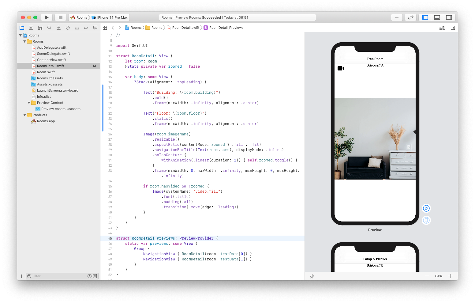
But, as you can see, those two texts ended up on each other. Luckily, there's an easy fix. All we need to do is wrapping those Text views in the VStack:
var body: some View {
    ZStack(alignment: .topLeading) {

        VStack {
            Text("Building: \(room.building)")
                .bold()
                .frame(maxWidth: .infinity, alignment: .center)

            Text("Floor: \(room.floor)")
                .italic()
                .frame(maxWidth: .infinity, alignment: .center)
        }

        Image(room.imageName)
            .resizable()
            .aspectRatio(contentMode: zoomed ? .fill : .fit)
            .navigationBarTitle(Text(room.name), displayMode: .inline)
            .onTapGesture {
                withAnimation(.linear(duration: 2)) { self.zoomed.toggle() }
            }
            .frame(minWidth: 0, maxWidth: .infinity, minHeight: 0, maxHeight: .infinity)

        if room.hasVideo && !zoomed {
            Image(systemName: "video.fill")
                .font(.title)
                .padding(.all)
                .transition(.move(edge: .leading))
        }
    }
}
Finally, let's add the VStack some padding so the text isn't so cramped up at the top edge:
VStack {
    Text("Building: \(room.building)")
        .bold()
        .frame(maxWidth: .infinity, alignment: .center)

    Text("Floor: \(room.floor)")
        .italic()
        .frame(maxWidth: .infinity, alignment: .center)
}
.padding(.all)
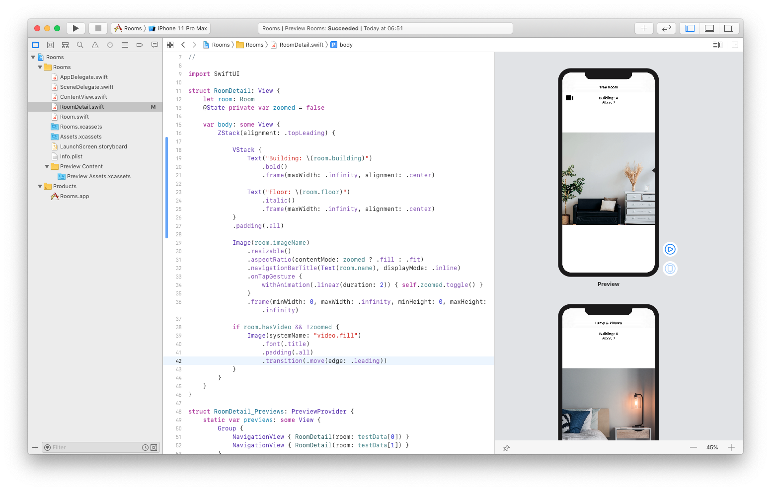
Now it's perfect! Notice how both previews use the appropriate room information.
Commit the changes.
Changing the data source
Our list of rooms is loaded from the static array, but we want to be able to add new rooms, delete them and change their order. This means that we need to change the source of data from the static array to the dynamic object.
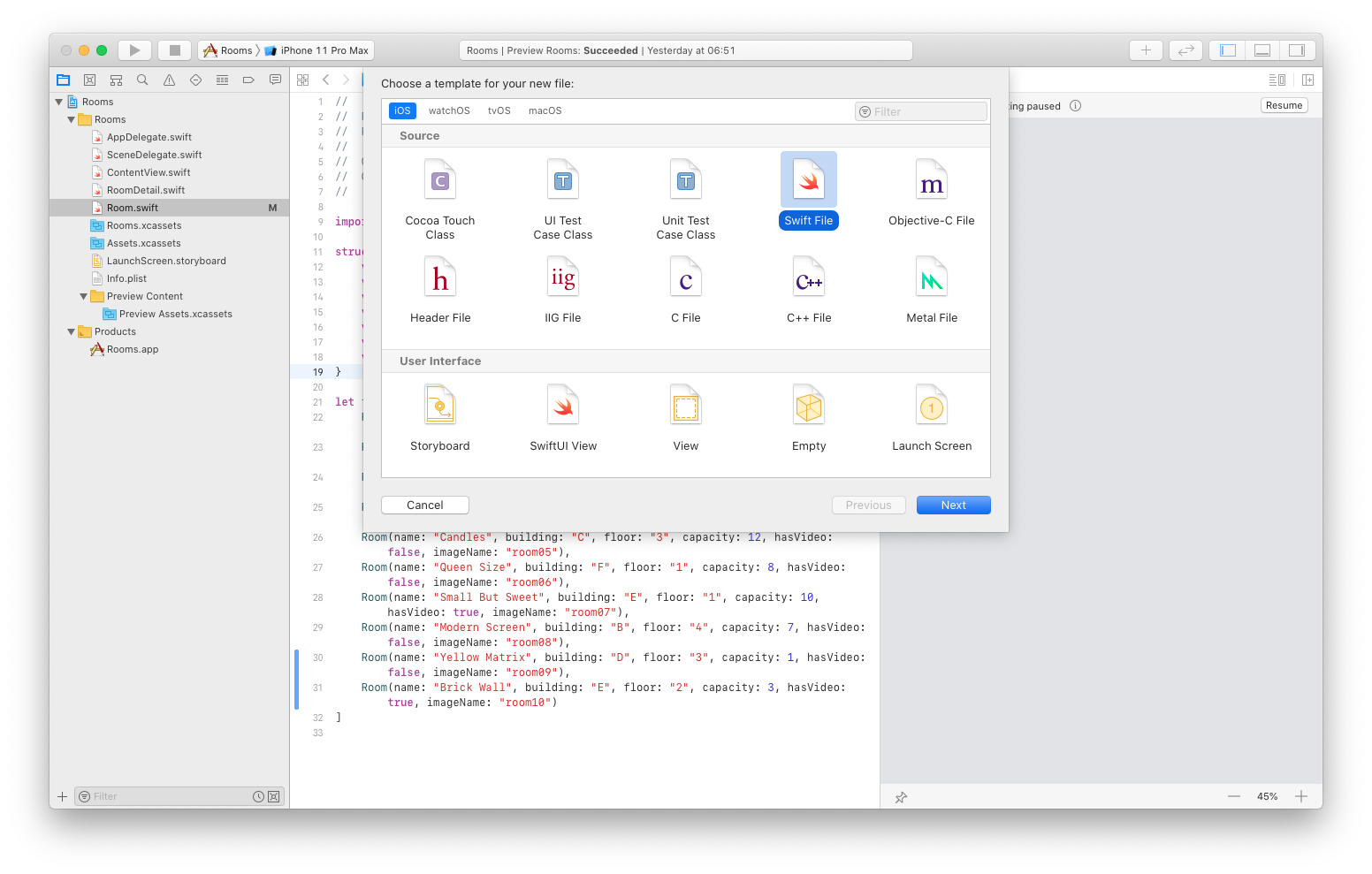
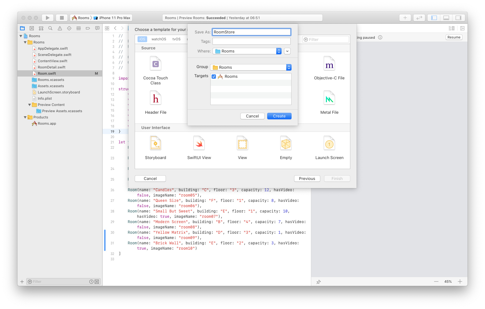
We will create a new file called RoomStore.swift where we will define an object for storing our data so we can change them over time.
CMD+N to create a new Swift file and save it as RoomStore:
Next, place this code inside instead of the default code:
import SwiftUI
import Combine

class RoomStore {
    var rooms: [Room]

    init(rooms: [Room] = []) {
        self.rooms = rooms
    }

}
This is just a regular Swift object with the rooms property and class initializer. Now we need to tell SwiftUI when the object based on this class changes. To do that, we just conform the class to the ObservableObject protocol:
class RoomStore: ObservableObject {
    var rooms: [Room]

    init(rooms: [Room] = []) {
        self.rooms = rooms
    }

}
Next, we need to define the objectWillChangeProperty which will store the PassthroughSubject that broadcasts elements to the subscriber. That's why we need to import the Combine model. You can think of it as some kind of notification center.
class RoomStore: ObservableObject {
    var rooms: [Room]

    init(rooms: [Room] = []) {
        self.rooms = rooms
    }

    let objectWillChange = PassthroughSubject<Void, Never>()

}
Finally, we will add the willSet method to our rooms so we can notify our subject when our rooms changed:
class RoomStore: ObservableObject {
    var rooms: [Room] {
        willSet { objectWillChange.send() }
    }

    init(rooms: [Room] = []) {
        self.rooms = rooms
    }

    let objectWillChange = PassthroughSubject<Void, Never>()

}
Now, go back to the ContentView.swift file and update the code.
Instead of rooms array, we will use our RoomStore object:
struct ContentView: View {
    @ObservedObject var store = RoomStore()

    var body: some View {
        NavigationView {
            List(rooms) { room in
                RoomCell(room: room)
            }
        .navigationBarTitle("Rooms")
        }
    }
}
Notice that we use the @ObservedObject when we define the store property. This tells SwiftUI to listen for changes to this property.
Let's also update our preview accordingly:
struct ContentView_Previews: PreviewProvider {
    static var previews: some View {
        ContentView(store: RoomStore(rooms: testData))
    }
}
And finally, we'll update our list to pull the rooms from the RoomStore:
struct ContentView: View {
    @ObservedObject var store = RoomStore()

    var body: some View {
        NavigationView {
            List(store.rooms) { room in
                RoomCell(room: room)
            }
        .navigationBarTitle("Rooms")
        }
    }
}
Great job!
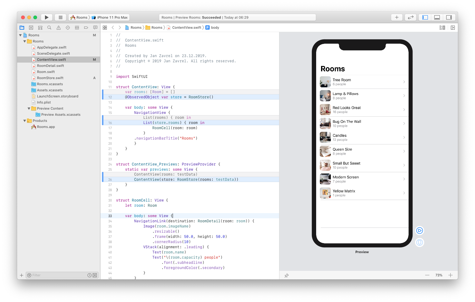
As you can see in the preview, everything works just fine as before, only this time, we pull rooms from our object instead of the array. This means we are ready to add our editing support since we no longer use a static source of data. And we will start by adding a button to our list that will allow us to add new rooms.
But before that, commit the changes.
Adding a new room
First, let's add a ForEach that will create a view for each item in its collection:
struct ContentView: View {
    @ObservedObject var store = RoomStore()

    var body: some View {
        NavigationView {
              List {
                ForEach (store.rooms) { room in
                    RoomCell(room: room)
                }
              }
        .navigationBarTitle("Rooms")
        }
    }
}
Now we can have a static element, that is our button alongside the list of rooms. So let's add the button. Drag it from the library right above the ForEach inside the List:
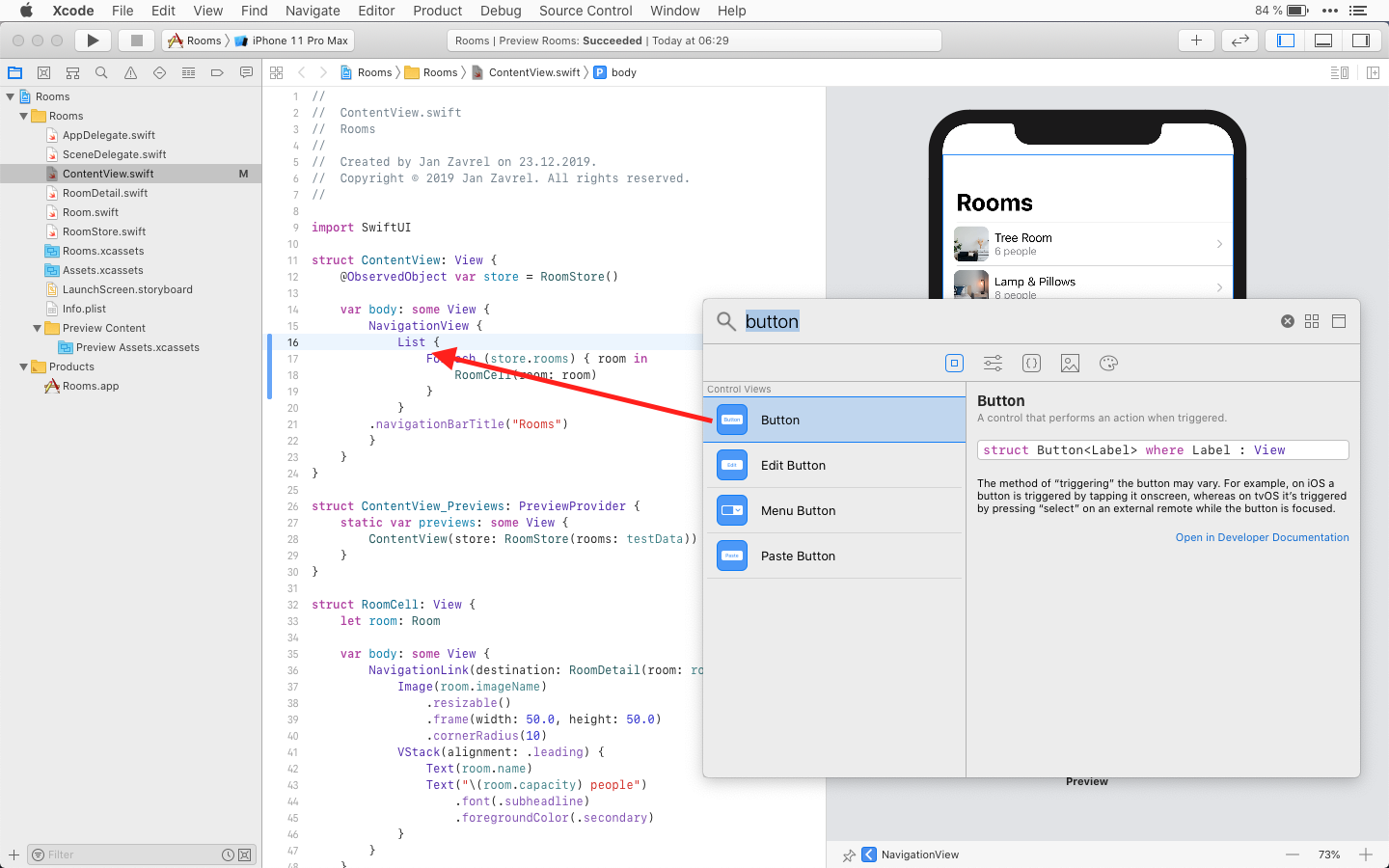
Make sure to place it in the right spot. This is what it looks like in the code:
var body: some View {
    NavigationView {
        List {
            Button(action: {}) {
                Text("Button")
            }
            ForEach (store.rooms) { room in
                RoomCell(room: room)
            }
        }
    .navigationBarTitle("Rooms")
    }
}
Now, let's update the Text so it shows "Add Room" instead of just "Button" and also, let's add a new method to specify the action for that button:
struct ContentView: View {
    @ObservedObject var store = RoomStore()

    var body: some View {
        NavigationView {
            List {
                Button(action: {}) {
                    Text("Add Room")
                }
                ForEach (store.rooms) { room in
                    RoomCell(room: room)
                }
            }
        .navigationBarTitle("Rooms")
        }
    }

    func addRoom() {
            store.rooms.append(Room(name: "Hall 2", building: "A", floor: "3", capacity: 2000, hasVideo: false, imageName: "room10"))
    }
}
The addRoom() method just appends a new instance of the Room struct to our object. We'll call it Hall 2 inside the building A on floor 3 with the capacity of 2000 seats and the image is room10.
Finally, we'll update the action of our button so it uses this new addRoom() method:
struct ContentView: View {
    @ObservedObject var store = RoomStore()

    var body: some View {
        NavigationView {
            List {
                Button(action: addRoom) {
                    Text("Add Room")
                }
                ForEach (store.rooms) { room in
                    RoomCell(room: room)
                }
            }
        .navigationBarTitle("Rooms")
        }
    }

    func addRoom() {
            store.rooms.append(Room(name: "Hall 2", building: "A", floor: "3", capacity: 2000, hasVideo: false, imageName: "room10"))
    }
}
Great job! Now, go to live mode and tap the Add Room button. A new room will be added at the bottom of the list and you can even tap it to reveal its details.
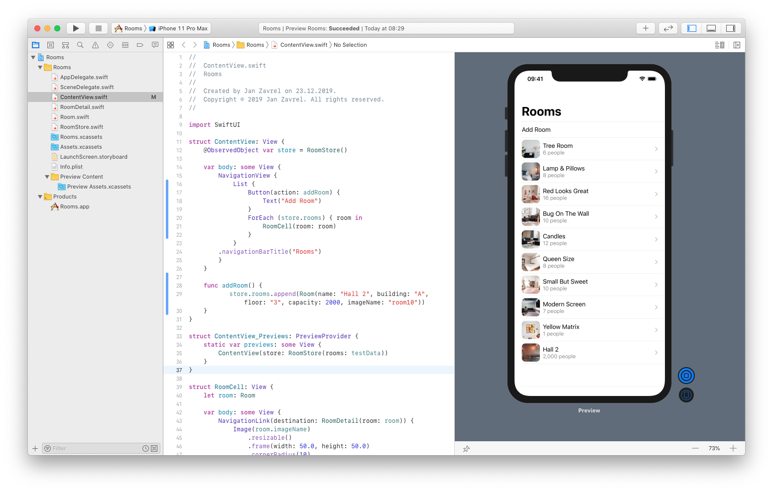
Finally, let's style our list so it looks even better.
To do that, we'll just put the Add Room button and the list of rooms into separate sections and style our list and SwiftUI will do the rest for us.
var body: some View {
    NavigationView {
        List {
            Section {
                Button(action: addRoom) {
                    Text("Add Room")
                }
            }
            Section {
                ForEach (store.rooms) { room in
                    RoomCell(room: room)
                }
            }
        }
        .navigationBarTitle("Rooms")
        .listStyle(GroupedListStyle())

    }
}
Now it looks way better:
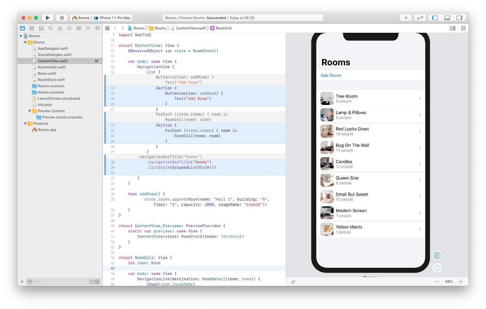
Ok, commit the changes so we can move on.
Deleting items
Let's add the deletion feature to our list.
First, we'll define a new method below the addRoom() method and call it the deleteRoom(). We'll pass in some Offsets. Than we will tell the store to remove the room at those offsets:
func addRoom() {
      store.rooms.append(Room(name: "Hall 2", building: "A", floor: "3", capacity: 2000, imageName: "room10"))
}

func deleteRoom(at offsets: IndexSet) {
      store.rooms.remove(atOffsets: offsets)
}
Then, we'll add the .onDelete modifier to the ForEach and we'll pass in as a parameter our deleteRoom() method:
var body: some View {
    NavigationView {
        List {
            Section {
                Button(action: addRoom) {
                    Text("Add Room")
                }
            }
            Section {
                ForEach (store.rooms) { room in
                    RoomCell(room: room)
                }
                .onDelete(perform: deleteRoom)
            }
        }
        .navigationBarTitle("Rooms")
        .listStyle(GroupedListStyle())

    }
}
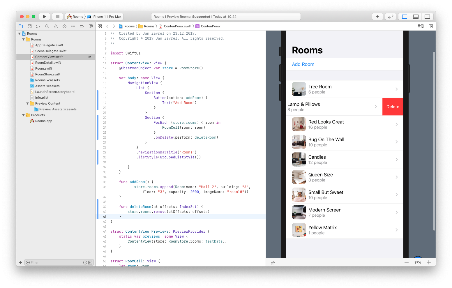
Now, go to the live mode, swipe on one of the rows and click to delete it! Or, you can even swipe all the way to the left as you might expect.
Reordering items
Let's take our list to the edit mode so we can not only delete items but reorder them as well.
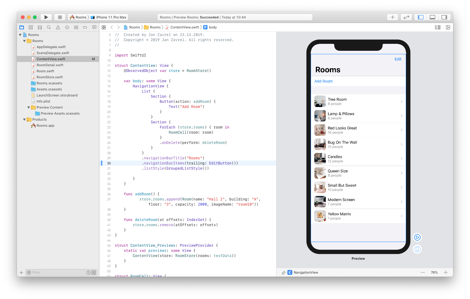
First, let's create the Edit button via navigationBarItems like this:
var body: some View {
    NavigationView {
        List {
            Section {
                Button(action: addRoom) {
                    Text("Add Room")
                }
            }
            Section {
                ForEach (store.rooms) { room in
                    RoomCell(room: room)
                }
                .onDelete(perform: deleteRoom)
            }
        }
        .navigationBarTitle("Rooms")
        .navigationBarItems(trailing: EditButton())
        .listStyle(GroupedListStyle())

    }
}
Next, let's add a new moveRoom() method for moving the item and we'll move from the source which is IndexSet to a destination which is Integer. And inside, we'll call our store and tell it to move the item:
func addRoom() {
    store.rooms.append(Room(name: "Hall 2", building: "A", floor: "3", capacity: 2000, imageName: "room10"))
}

func deleteRoom(at offsets: IndexSet) {
    store.rooms.remove(atOffsets: offsets)
}

func moveRoom(from source: IndexSet, to destination: Int) {
    store.rooms.move(fromOffsets: source, toOffset: destination)
}
Finally, just like before, we'll add another modifier and tell it to call our newly created method:
var body: some View {
    NavigationView {
        List {
            Section {
                Button(action: addRoom) {
                    Text("Add Room")
                }
            }
            Section {
                ForEach (store.rooms) { room in
                    RoomCell(room: room)
                }
                .onDelete(perform: deleteRoom)
                .onMove(perform: moveRoom)
            }
        }
        .navigationBarTitle("Rooms")
        .navigationBarItems(trailing: EditButton())
        .listStyle(GroupedListStyle())

    }
}
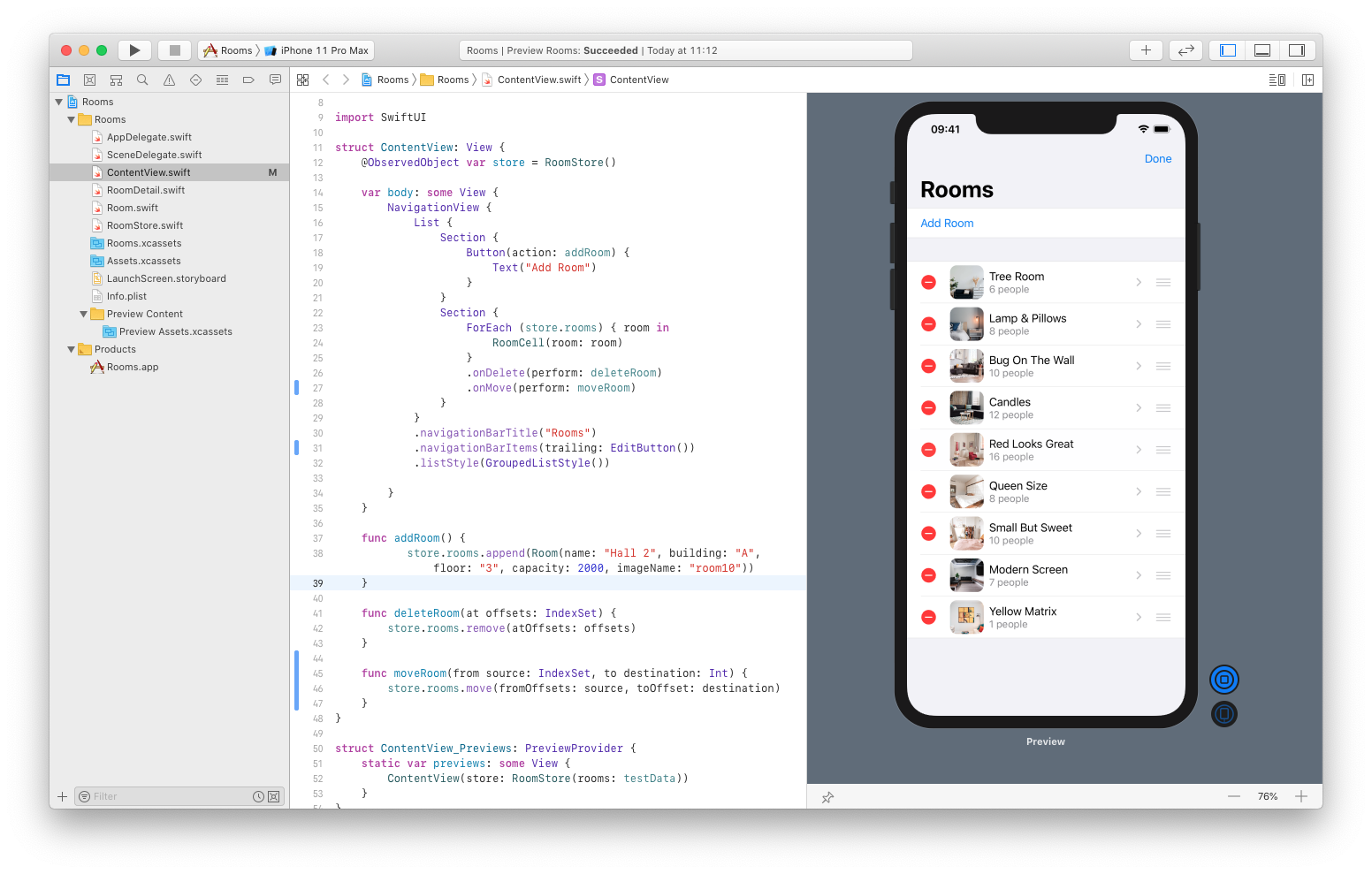
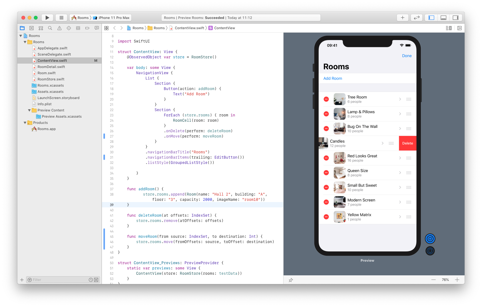
Now, go back to the live mode, click the Edit button and try to move the items around. Also, you can tap the delete icon the reveal Delete button and remove the item:
Adding more previews
We'll add more previews the same way we already did in the RoomDetail.swift file.
So, let's wrap our ContentView inside Group and add another ContentView:
struct ContentView_Previews: PreviewProvider {
    static var previews: some View {
        Group {
            ContentView(store: RoomStore(rooms: testData))

            ContentView(store: RoomStore(rooms: testData))
        }
    }
}
Now, with the second preview, we can change the environment to use much larger size:
struct ContentView_Previews: PreviewProvider {
    static var previews: some View {
        Group {
            ContentView(store: RoomStore(rooms: testData))

            ContentView(store: RoomStore(rooms: testData))
                .environment(\.sizeCategory, .extraExtraExtraLarge)
        }
    }
}
That's pretty cool, huh?
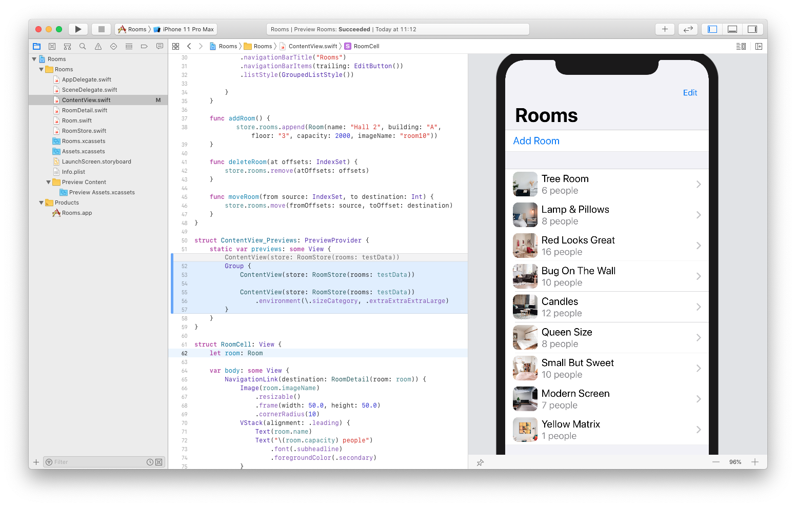
Now, let's test how our app would look like with the dark mode. We'll create yet another preview and use the dark color scheme:
struct ContentView_Previews: PreviewProvider {
    static var previews: some View {
        Group {
            ContentView(store: RoomStore(rooms: testData))

            ContentView(store: RoomStore(rooms: testData))
                .environment(\.sizeCategory, .extraExtraExtraLarge)

            ContentView(store: RoomStore(rooms: testData))
                .environment(\.colorScheme, .dark)
        }
    }
}
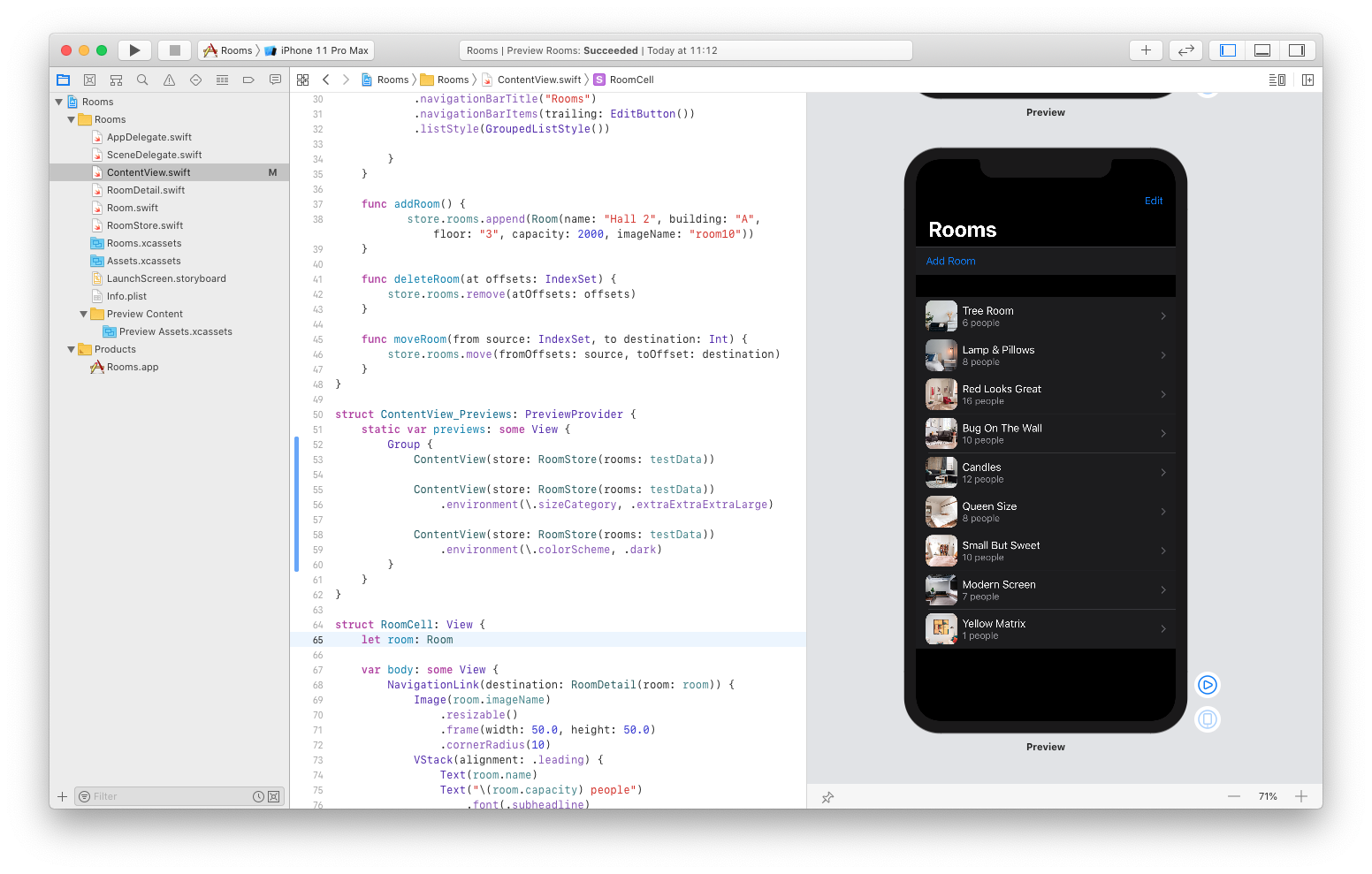
And when you test the app in the live mode, everything will work as expected. So, let's add a new Room, check its details, move it to the top and finally delete it.
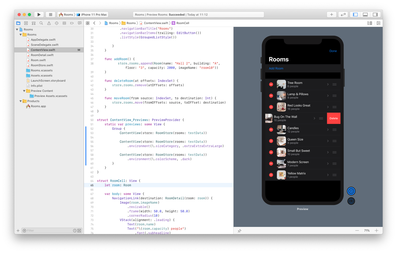
Perfect! I hope you've learned a lot today.
If you want to support me, please, check my courses on Udemy and Skillshare.
Thank you.
